-
Health
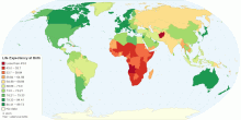
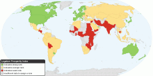
Current World Life Expectancy at Birth
This map shows current world life expectancy at birth. Life expectancy at birth is the expected average number of years to be lived by a group of people born in ...4.49 rating | 132,498 views | 2 Comments15 years ago -
Education
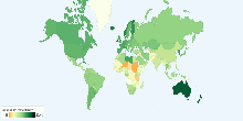
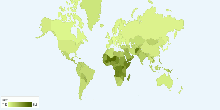
School Life Expectancy, Primary to Tertiary around ...
This chart shows school life expectancy (years), primary to tertiary education around the world. School life expectancy (SLE) is the total number of years of sch ...4.00 rating | 19,485 views | Discuss this17 years ago -
Education
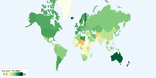
School Life Expectancy, Primary to Tertiary around ...
This chart shows school life expectancy (years), primary to tertiary education for female around the world. School life expectancy (SLE) is the total number of y ...4.56 rating | 9,678 views | Discuss this17 years ago -
Education
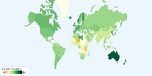
School Life Expectancy, Primary to Tertiary around ...
This chart shows school life expectancy (years), primary to tertiary education for male around the world. School life expectancy (SLE) is the total number of yea ...3.00 rating | 9,803 views | Discuss this17 years ago -
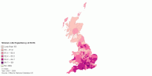
Health
Women - Life Expectancy at Birth by UK Local Authority
This map shows Women life expectancy at birth by United Kingdom Local authority, 2007-2009.5.00 rating | 6,155 views | Discuss this15 years ago -
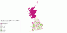
Health
Men: Change in Life Expectancy at Birth by UK Local ...
This map shows Men change in life expectancy at birth by United Kingdom Local authority, 2000-02 to 2007-09.5.00 rating | 5,104 views | Discuss this15 years ago -
Health
Current United Kindgom Life Expectancy at Birth
These page shows Men/Women life expectancy at birth and change in life expectancy at birth by United Kingdom Local authority for 2007-2009.3.67 rating | 4,795 views | Discuss this15 years ago -
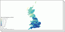
Health
Men - Life Expectancy at Birth by UK Local Authority
This map shows Men life expectancy at birth by United Kingdom Local authority, 2007-2009.3.67 rating | 7,439 views | Discuss this15 years ago -
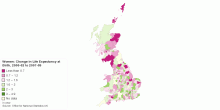
Health
Women: Change in Life Expectancy at Birth by UK Loc ...
This map shows Women change in life expectancy at birth by United Kingdom Local authority, 2000-02 to 2007-09.0.00 rating | 4,633 views | Discuss this15 years ago -
Social
The Legatum Prosperity Index
This map shows the Prosperity Index for 110 countries. 2010 Key Findings: Entrepreneurship and opportunity correlate more closely to a nation's overall pros ...4.33 rating | 32,479 views | 3 Comments15 years ago -
Health
Current World Birth Rate
This chart shows current world birth rate. Current World Birth Rate: 19.95 births/1,000 people This entry gives the average annual number of births during a ye ...3.59 rating | 46,868 views | 5 Comments17 years ago -
Health
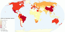
Percentage of Births by Caesarean Section
This map shows percentage of births by caesarean section among all live births in a given time period.4.63 rating | 38,297 views | Discuss this15 years ago -
Health
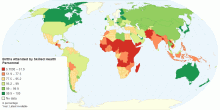
Percentage of Births Attended by Skilled Health Personnel
This map shows percentage of deliveries attended by health personnel(doctors, nurses or midwives) trained in providing life saving obstetric care, including givi ...4.31 rating | 18,721 views | 4 Comments15 years ago -
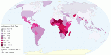
Health
Adolescent Birth Rate
This map shows adolescent birth rate, that measures the annual number of births to women 15 to 19 years of age per 1,000 women in that age group. It represents t ...4.55 rating | 35,186 views | 3 Comments15 years ago -
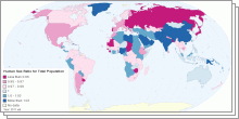
People
World Sex Ratio 2011
This collection of interactive maps shows Sex Ratio in five age groups - at birth, under 15 years, 15-64 years, 65 years and over, and for the total population. ...4.01 rating | 218,353 views | 3 Comments15 years ago