-
Country Info
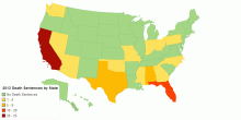
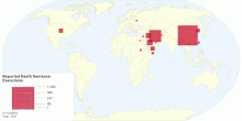
2013 Death Sentences by State
Number of death sentences handed down by each U.S. State in 20135.00 rating | 3,843 views | Discuss this12 years ago -
Country Info
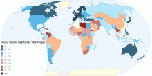
Motor Vehicle Deaths Per 100k People
Motor Vehicle Deaths Per 100k People5.00 rating | 2,960 views | Discuss this12 years ago -
Health
Cancer Deaths per 100,000 Population by Country
This chart shows the Cancer Deaths per 100,000 population by country. Cancer is a relatively common disease. Generally, this category should include only people ...3.29 rating | 14,408 views | Discuss this11 years ago -
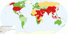
Country Info
Capital Punishment Around the World
This chart shows use of capital punishment or the death penalty around the world. In 2010 one more African country, Gabon, abolished the death penalty, bringing ...4.46 rating | 73,185 views | 5 Comments15 years ago -
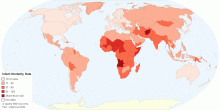
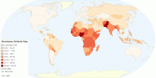
Health
Current World Infant Mortality Rate
This map shows current world infant mortality rate. Infant mortality rate means the number of deaths of infants under one year old in a given year per 1,000 live ...4.37 rating | 35,940 views | Discuss this15 years ago -
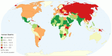
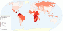
Drugs & Crime
Current Worldwide Homicide/Murder Rate
This map shows homicide or murder rates per 100,000 population around the world. Homicide is defined as unlawful death purposefully inflicted on a person by anot ...4.42 rating | 828,132 views | 79 Comments15 years ago -
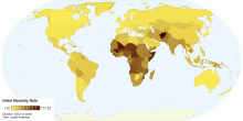
Country Info
Infant Mortality Rate
Infant Mortality rate per 1,000 live births.5.00 rating | 4,621 views | Discuss this12 years ago -
Social
Worldwide Distribution of Suicides Rates by Gender ...
This chart shows worldwide distribution of suicides rates by gender and age for year 2000. Suicide is among the three leading causes of death among those aged 15 ...4.08 rating | 48,681 views | 3 Comments16 years ago -
Social
Reported Death Sentence Executions
This map shows death sentence executions in 2011.5.00 rating | 19,549 views | Discuss this14 years ago -
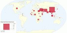
Social
Reported Death Sentence
This map shows number of death sentence given in 2011.4.48 rating | 521,887 views | 1 Comment14 years ago -
Health
Current Worldwide Stillbirth Rate (per 1000 births)
This map shows Worldwide Stillbirth rate (per 1000 births). Stillbirth is the term used to describe the loss of a pregnancy or the birth of an infant that has di ...4.70 rating | 80,604 views | Discuss this15 years ago -
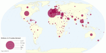
Tourism
Where Are Britons Most Likely to Get into Trouble A ...
This interactive map shows: where are Britons most likely to get arrested? Which British embassies and consulates are busiest? Where are the drug arrests? Where ...4.60 rating | 7,914 views | 2 Comments15 years ago -
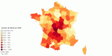
Health
Causes de décès en 2008 : comparaisons départeme ...
Le taux de mortalité est le rapport du nombre de décès de l'année à la population totale moyenne de l'année. C ...1.00 rating | 3,961 views | Discuss this15 years ago -
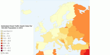
Health
Estimated Road Traffic Death Rate Per 100,000 Popul ...
Road traffic deaths in Europe in 20105.00 rating | 4,513 views | Discuss this12 years ago -
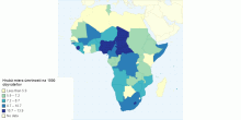
Population
Hrubá miera Ăşmrtnosti (na 1 000 obyvateÄľov) podÄ ...
Hrubá miera úmrtnosti (na 1 000 obyvateÄľov) podÄľa krajín v Afrike, v roku 20190.00 rating | 1,474 views | Discuss this5 years ago