-
Health
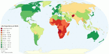
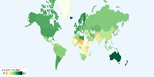
Current World Life Expectancy at Birth
This map shows current world life expectancy at birth. Life expectancy at birth is the expected average number of years to be lived by a group of people born in ...4.49 rating | 132,498 views | 2 Comments15 years ago -
People
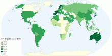
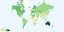
Life Expectancy at Birth in Years
This map shows life expectancy at birth in years by country Life expectancy is a statistical measure of how long a person or organism may live, based on the yea ...4.11 rating | 7,701 views | Discuss this11 years ago -
Education
School Life Expectancy, Primary to Tertiary around ...
This chart shows school life expectancy (years), primary to tertiary education around the world. School life expectancy (SLE) is the total number of years of sch ...4.00 rating | 19,484 views | Discuss this17 years ago -
Others
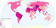
Unhealthy Life Expectancy by Country
This chart shows Unhealthy Life Expectancy by Country. Health is the level of functional and metabolic efficiency of a living organism. In humans it is the abil ...3.29 rating | 7,639 views | Discuss this10 years ago -
Education
School Life Expectancy, Primary to Tertiary around ...
This chart shows school life expectancy (years), primary to tertiary education for female around the world. School life expectancy (SLE) is the total number of y ...4.56 rating | 9,678 views | Discuss this17 years ago -
Education
School Life Expectancy, Primary to Tertiary around ...
This chart shows school life expectancy (years), primary to tertiary education for male around the world. School life expectancy (SLE) is the total number of yea ...3.00 rating | 9,803 views | Discuss this17 years ago -
Social
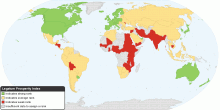
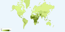
The Legatum Prosperity Index
This map shows the Prosperity Index for 110 countries. 2010 Key Findings: Entrepreneurship and opportunity correlate more closely to a nation's overall pros ...4.33 rating | 32,479 views | 3 Comments15 years ago -
People
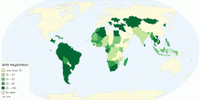
Birth Registration By Country
This chart shows birth registration details by country. Birth registration is the process by which a childʼs birth is record- ed in the civil register by the g ...4.33 rating | 5,766 views | Discuss this11 years ago -
Health
Current World Birth Rate
This chart shows current world birth rate. Current World Birth Rate: 19.95 births/1,000 people This entry gives the average annual number of births during a ye ...3.59 rating | 46,868 views | 5 Comments17 years ago -
Population
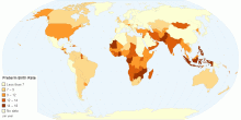
Preterm Birth Rate by Country
This chart shows preterm birth rate by country. Preterm birth, also known as premature birth, is the birth of a baby at less than 37 weeks gestational age.These ...4.02 rating | 15,484 views | Discuss this11 years ago -
Health
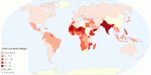
Child Low Birth Weight by Country
This map shows child low birth weight by country. Low birth weight (LBW) is defined as a birth weight of a liveborn infant of less than 2,500 g (5 pounds 8 ounc ...4.69 rating | 8,045 views | Discuss this11 years ago -
Health
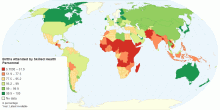
Percentage of Births Attended by Skilled Health Personnel
This map shows percentage of deliveries attended by health personnel(doctors, nurses or midwives) trained in providing life saving obstetric care, including givi ...4.31 rating | 18,721 views | 4 Comments15 years ago -
Health
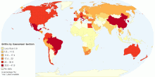
Percentage of Births by Caesarean Section
This map shows percentage of births by caesarean section among all live births in a given time period.4.63 rating | 38,297 views | Discuss this15 years ago -
Health
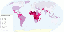
Adolescent Birth Rate
This map shows adolescent birth rate, that measures the annual number of births to women 15 to 19 years of age per 1,000 women in that age group. It represents t ...4.55 rating | 35,186 views | 3 Comments15 years ago -
People
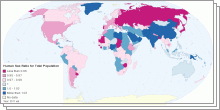
World Sex Ratio 2011
This collection of interactive maps shows Sex Ratio in five age groups - at birth, under 15 years, 15-64 years, 65 years and over, and for the total population. ...4.01 rating | 218,352 views | 3 Comments15 years ago