-
People
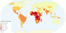
Female (15-19 Years) Fertility Rate By Country
This charts shows female (15-19) years fertility rate details by country. Fertility rate represents the number of children that would be born to a woman if she ...4.50 rating | 8,063 views | Discuss this11 years ago -
People
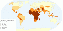
Population Proportion Under 15 by Country
This chart shows population proportion under 15 details by country. The population proportion is a number representing a part of a population and is therefore a ...3.00 rating | 5,800 views | Discuss this11 years ago -
People
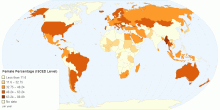
ISCED Level of Female Percentage by Country
This chart shows ISCED(International Standard Classification of Education) Level of Female Percentage. The International Standard Classification of Educati ...5.00 rating | 4,861 views | Discuss this11 years ago -
People
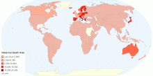
Lifetime Risk of Maternal Death
This chart shows lifetime risk of maternal death details by country. Life time risk of maternal death is the probability that a 15-year-old female will die even ...3.00 rating | 5,012 views | Discuss this11 years ago -
People
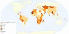
Early Initiation of Breastfeeding
This chart shows early initiation of breastfeeding details by country. Breastfeeding or nursing is feeding of babies and young children with milk from a female ...3.67 rating | 5,545 views | Discuss this11 years ago -
People
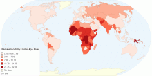
Female Mortality Under Age Five
This chart shows female mortality (under age 5) details by country. Mortality rate, or death rate,is a measure of the number of deaths (in general, or due to a ...0.00 rating | 4,667 views | Discuss this11 years ago -
People
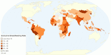
Exclusive Breastfeeding Rate by Country
This chart shows exclusive breastfeeding rate by country. Breastfeeding or nursing is feeding of babies and young children with milk from a female breast.Breast ...3.53 rating | 8,036 views | Discuss this11 years ago -
People
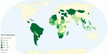
Birth Registration By Country
This chart shows birth registration details by country. Birth registration is the process by which a childʼs birth is record- ed in the civil register by the g ...4.20 rating | 5,635 views | Discuss this11 years ago -
People
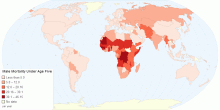
Male Mortality Under Age Five
This chart shows male mortality (under age 5) details by country. Mortality rate, or death rate,is a measure of the number of deaths (in general, or due to a sp ...0.00 rating | 3,542 views | Discuss this11 years ago -
People
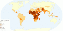
Total Fertility Rate by Country
This map shows fertility rate by country. Total fertility rate represents the number of children that would be born to a woman if she were to live to the end of ...3.15 rating | 11,490 views | Discuss this11 years ago -
People
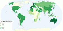
Life Expectancy at Birth in Years
This map shows life expectancy at birth in years by country Life expectancy is a statistical measure of how long a person or organism may live, based on the yea ...4.11 rating | 7,585 views | Discuss this11 years ago -
People
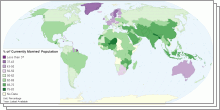
World Marriage Data
This group of interactive maps provides a comparable information on the marital status of the population, as well as the number of marriages and divorces for all ...3.54 rating | 76,880 views | 4 Comments15 years ago -
People
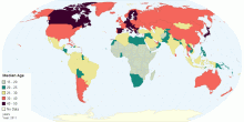
Global Median Age
This map shows the median age that divides a population into two numerically equal groups; that is, half the people are younger than this age and half are older. ...4.58 rating | 49,484 views | 2 Comments15 years ago -
People
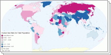
World Sex Ratio 2011
This collection of interactive maps shows Sex Ratio in five age groups - at birth, under 15 years, 15-64 years, 65 years and over, and for the total population. ...4.01 rating | 218,138 views | 3 Comments15 years ago -
People
Top 100 Baby Names in England and Wales through 2010
This group of interactive chart shows top 100 baby names in England and Wales through 2010. Oliver and Olivia remained the most popular baby names in England and Wales.4.61 rating | 18,427 views | 3 Comments15 years ago
