-
Education
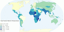
Pupil Teacher Ratio for Primary School
This chart depicts the pupil-teacher ratio worldwide for primary schools. This ratio is calculated by dividing the number of pupils enrolled in primary school di ...3.00 rating | 4,481 views | Discuss this12 years ago -
Health
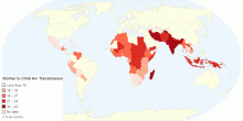
Mother to Child Hiv Transmission by Country
This map shows HIV transmission details from mother to child by country The human immunodeficiency virus (HIV) is a lentivirus (a subgroup of retrovirus) that c ...5.00 rating | 5,217 views | Discuss this11 years ago -
People
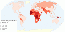
Female Mortality Under Age Five
This chart shows female mortality (under age 5) details by country. Mortality rate, or death rate,is a measure of the number of deaths (in general, or due to a ...0.00 rating | 4,731 views | Discuss this11 years ago -
Country Info
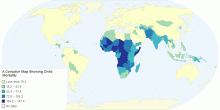
A Choropleth Map Showing Child Mortality in 2013
I found out that the child mortality rates are highest in Africa. The Child mortality rate is also high in India but it is very low in the U.S.A and In Western Europe.5.00 rating | 2,319 views | Discuss this11 years ago -
Country Info
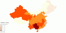
Fertility in China
Fertility rates in China's provinces, data from 2014.0.00 rating | 3,633 views | Discuss this11 years ago -
Population
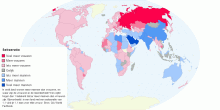
Sekseratio
In wel5.00 rating | 10,819 views | Discuss this11 years ago -
People
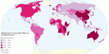
Employment to Population Ratio of Female by Country
This chart shows Employment - to - Population ratio of Female (15 - 24 yr) by country. Employment to population ratio is the proportion of a country's popul ...3.67 rating | 5,654 views | Discuss this11 years ago -
Health
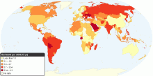
Bad teeth per child (12 yr)
The weighted average of the number of Decayed (D), Missing (M), Filled (F) teeth (T) among the 12 years old in a country (DMFT). It is meant to reflect the preva ...3.29 rating | 7,789 views | Discuss this16 years ago -
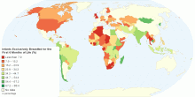
Health
Percentage of Infants Exclusively Breastfed for the ...
This map shows percentage of Infants that are exclusively breastfed for the first six months of life. The World Health Organization (WHO) and the American Acade ...4.72 rating | 22,958 views | 2 Comments15 years ago -
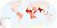
Health
Child Low Birth Weight by Country
This map shows child low birth weight by country. Low birth weight (LBW) is defined as a birth weight of a liveborn infant of less than 2,500 g (5 pounds 8 ounc ...4.69 rating | 8,060 views | Discuss this11 years ago -
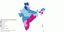
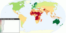
Population
India's Sex Ratio for Total Population
This map shows India's Sex Ratio for total population in 2011 Census. India's Sex Ratio: 940 females per 1000 males (2011) India's Sex Ratio: 933 f ...4.74 rating | 109,743 views | Discuss this15 years ago -
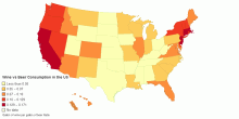
Food & Agriculture
Wine vs Beer Consumption in the US
Wine/Beer Consumption in the United States Data Source: © Copyright, 2011 Beer Institute Washington, DC3.00 rating | 7,735 views | Discuss this14 years ago -
Social
World Child Development Index
This chart shows the Child Development Index (CDI) around the world. World Performance CDI Score: 17.5 Time period: 2000-2006 Education: 11.4 H ...4.13 rating | 29,342 views | Discuss this16 years ago -
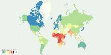
Social
The Best and Worst Countries to Be a Mother
This map shows 2010 Mothers' Index around the world. The Mothers' Index helps document conditions for mothers and children in 160 countries (43 developed nations ...4.00 rating | 49,918 views | 8 Comments16 years ago -
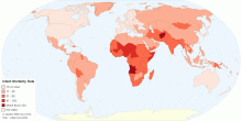
Health
Current World Infant Mortality Rate
This map shows current world infant mortality rate. Infant mortality rate means the number of deaths of infants under one year old in a given year per 1,000 live ...4.37 rating | 35,947 views | Discuss this15 years ago