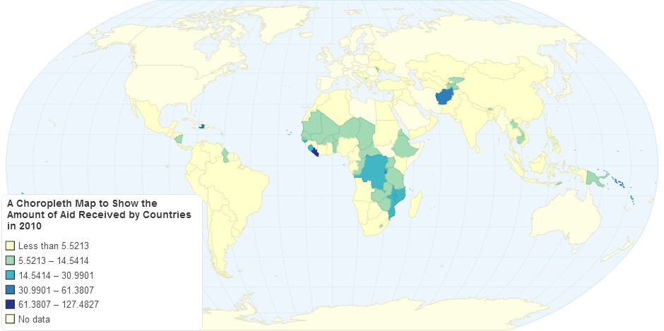
This Choropleth Map on the website Chartsbin shows the amount of Aid Received by Countries in 2010 as a Percentage. Using data from Gapminder, it is clear to see that in Africa, South America and Asia the amount of aid received is wildy more than in Europe, North America and Oceania. There are two kind of correlations that support this: The poorer the country, the more aid it recieves. This would make sense as less prosperous countries need more aid that the prosperous ones. The other correlation is that the more prone to having natural disasters a country is (tsunamis on the Asian coast, famines and droughts in Africa) the more aid it recieves.
11 years ago

