Get free updates by Email
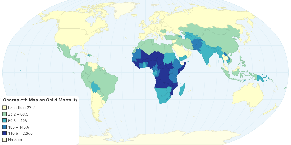
This is a choropleth map describing the child mortality rate. The darker areas are where there are more deaths and these countries appear on the map near the equator. Most of these countries are the poor countries.