-
Country Info
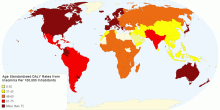
Age Standardised Disability Adjusted Life Year Daly ...
Data from WHO http://www.who.int/healthinfo/global_burden_disease/estimates_country/en/5.00 rating | 10,689 views | Discuss this11 years ago -
Country Info
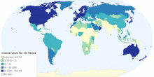
Internet Users Per 100 People
It is clear from the map that the more developed countries the more internet users they have.5.00 rating | 2,159 views | Discuss this11 years ago -
Country Info
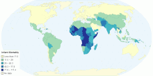
Infant Mortality
Infant mortality across the world, showing the development of countries based on how many infant deaths occur. A lesser amount means a more developed country.0.00 rating | 1,009 views | Discuss this11 years ago -
Country Info
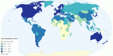
Life Expectancy 2013
This map shows the estimated life expectancy across the globe. A larger expectancy rate suggests that it is a developed country1.00 rating | 2,598 views | Discuss this11 years ago -
Country Info
Hustota zalidnění států světa v r. 2011
Map showing the population density of countries in 2010.0.00 rating | 2,529 views | Discuss this11 years ago -
Country Info
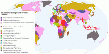
Educational Background of World Leaders
This chart shows the Educational Background of World Leaders by country.This amazing map takes a look at what the world leaders studied for the highest degree th ...3.91 rating | 10,488 views | Discuss this10 years ago -
Country Info
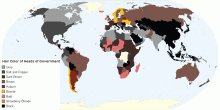
Hair Color of World Leaders
This chart shows the Hair Color of World Leaders(Heads of Government). Blondes thrive in northern Europe and baldness prospers in Africa. There's a sweep of ...3.80 rating | 164,249 views | Discuss this10 years ago -
Country Info
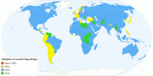
Sovereign States by Century of Current Flag Adoption
This chart shows the Sovereign States by Century of Current Flag Adoption. A flag is a piece of fabric with a distinctive design that is used as a symbol, as a ...3.33 rating | 13,867 views | Discuss this10 years ago -
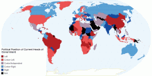
Country Info
Political Position of Current Heads of Government
This chart shows the Political Position of Current Heads of Government by country. A political spectrum is a system of classifying different political positions ...3.25 rating | 16,086 views | Discuss this10 years ago -
Country Info
DNSSEC Deployment Status on 25-01-2016.
This chart shows the DNSSEC Deployment Status on 25-01-2016. The maps provide a view into global DNSSEC deployment and break the deployment status of top-level ...3.00 rating | 9,040 views | Discuss this10 years ago -
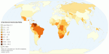
Country Info
Intentional Homicide Rate
List of countries by intentional homicide rate per year per 100,000 inhabitants. The reliability of underlying national murder rate data may vary. ...5.00 rating | 2,601 views | Discuss this10 years ago -
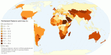
Country Info
Permanent Pasture Land Use (%)
Permanent Pastures: natural or artificial grasslands and shrublands able to be used for grazing livestock. World Average is 17.6% CIA (2011)5.00 rating | 1,639 views | Discuss this10 years ago -
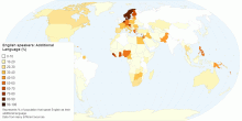
Country Info
English Speakers - Additional Language (%)
Represents % of population that speak English as their additional language. Data from many different sources0.00 rating | 3,442 views | Discuss this10 years ago -
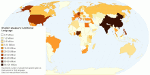
Country Info
English Speakers - Additional Language
Represents number of people that speak English as their second or third language. Data from many different sources0.00 rating | 2,971 views | Discuss this10 years ago -
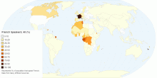
Country Info
French Speakers: All (%)
Represents % of population that speak French. Data from many different sources5.00 rating | 3,003 views | Discuss this10 years ago