-
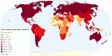
Country Info
Total Literacy Rate Adult Lambert
Total Literacy Rate Adult Lambert0.00 rating | 2,831 views | Discuss this12 years ago -
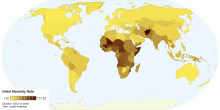
Country Info
Infant Mortality Rate
Infant Mortality rate per 1,000 live births.5.00 rating | 3,714 views | Discuss this10 years ago -
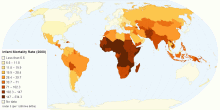
Country Info
Infant Mortality Rate (2000)
Infant Mortality Rate, 2000 - World Bank under 5 deaths /1,000 live births Rank and Score/Country0.00 rating | 3,266 views | Discuss this11 years ago -
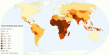
Country Info
Infant Mortality Rate (2010)
Infant Mortality Rate, under 5 (1,000 live births) World Bank, 2010 Rank and Score5.00 rating | 3,442 views | Discuss this11 years ago -
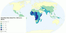
Country Info
Mortality Rate Infant Per 1000 Live Births
Mortality rate infant per 1000 live births0.00 rating | 3,130 views | Discuss this12 years ago -
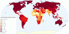
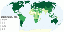
Country Info
Literacy Rate Adult Total of People Ages 15 and Above
Literacy Rate Adult Total of People Ages 15 and Above3.00 rating | 3,446 views | Discuss this12 years ago -
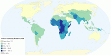
Country Info
Infant Mortality Rate in 2008
This map shows the worldwide infant mortality rate in 2008. The Northern hemisphere seems to have fewer deaths than the southern, meaning that they more doctors, ...5.00 rating | 2,344 views | Discuss this10 years ago -
Country Info
Total Adult Literacy Rate of People Ages 15 and Abo ...
For personal use0.00 rating | 2,694 views | Discuss this12 years ago -
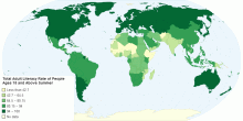
Country Info
Total Adult Literacy Rate in 2010 of People Ages 15 ...
Total Adult Literacy Rate in 2010 of People Ages 15 Summer0.00 rating | 3,173 views | Discuss this12 years ago -
Country Info
HDI
The HDI of the countries of the world.0.00 rating | 755 views | Discuss this10 years ago -
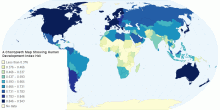
Country Info
A Choropleth Map Showing Human Development Index(HDI)
A 9-tone Choropleth map4.20 rating | 3,847 views | Discuss this10 years ago -
Country Info
HDI in Countries of the World
HDI0.00 rating | 811 views | Discuss this10 years ago -
Country Info
Choropleth Map on HDI
Choropleth map on HDI 20110.00 rating | 828 views | Discuss this10 years ago -
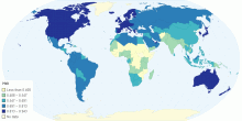
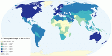
Country Info
A Choropleth Graph of HDI in 2011
A Cohropleth graph showing HDI in 2011. The highest examples are in North America and Western Europe, eg. Norway 0.94. The lowest examples are in Sub-Sahar ...0.00 rating | 796 views | Discuss this10 years ago -
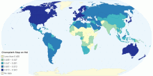
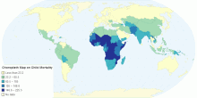
Country Info
Choropleth Map on Child Mortality per thousand
This is a choropleth map describing the child mortality rate. The darker areas are where there are more deaths and these countries appear on the map near the equ ...5.00 rating | 899 views | Discuss this10 years ago