-
Country Info
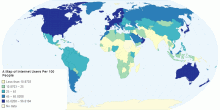
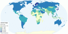
A Map of Internet Users Per 100 People
This map shows that the more developed countries have more internet users0.00 rating | 2,003 views | Discuss this11 years ago -
Infrastructure
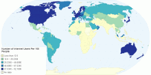
Number of Internet Users Per 100 People
map of internet users across the world5.00 rating | 4,946 views | Discuss this11 years ago -
Country Info
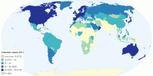
A Choropleth Map Showing Internet Users Per 100 People
This Choropleth Map shows Internet Users per 100 People in 2011. Note that there are no statistics for some countries - this is due to insuficcient data.5.00 rating | 2,311 views | Discuss this11 years ago -
Country Info
Internet Users 2011
Internet Users 20110.00 rating | 1,135 views | Discuss this11 years ago -
Information and Communication Technology
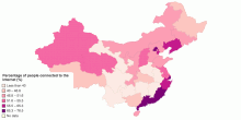
Internet Penetration in Chinese Provinces
This is a map showing percentage of internet users in each China province0.00 rating | 2,454 views | Discuss this9 years ago -
Country Info
Internet Usage by Country
Internet penetration rates by country0.00 rating | 824 views | Discuss this9 years ago -
Information and Communication Technology
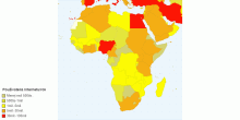
Používatelia Internetu
Mapa zobrazuje počet obytvateľov v krajinách Afriky, ktorí používajú internet.0.00 rating | 982 views | Discuss this5 years ago -
Country Info
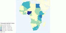
Pouivatelia Internetu V Afrike
Použivatelia internetu v Afrike z 30.9.2020.5.00 rating | 1,437 views | Discuss this5 years ago -
Information and Communication Technology
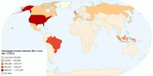
Tweets Per Country
The map visualises the number of geocoded tweets per country between March 5 and March 13 2012. More information available from Dr. Mark Graham (www.geospace.co.uk)3.00 rating | 12,950 views | Discuss this14 years ago -
Country Info
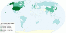
World Interent Users for 2000
Countries according to Internet users in the year 20000.00 rating | 2,630 views | Discuss this14 years ago -
Others
Top 10 Most Popular Move Abroad Countries in 2012
Statistics about number of internet searches done by people looking to move to new countries0.00 rating | 2,001 views | Discuss this14 years ago -
Information and Communication Technology
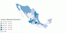
Acceso a Redes De Informacion
este mapa te servira para hacer una comparacion entre la cantidad de usarios que usan internet, y los que cuentan con internet dentro de sus hogares5.00 rating | 2,491 views | Discuss this13 years ago -
Country Info
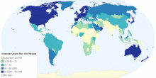
Internet Users Per 100 People
It is clear from the map that the more developed countries the more internet users they have.5.00 rating | 2,140 views | Discuss this11 years ago -
Information and Communication Technology
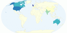
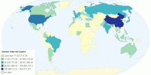
Global Internet Users
A chloropleth map of the total number of internet users across the globe3.00 rating | 3,700 views | Discuss this11 years ago -
Information and Communication Technology
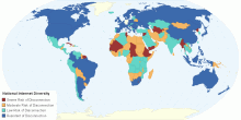
National Internet Diversity at the International Frontier
This chart shows the National Internet Diversity at the International Frontier. The Internet is supposed to be a distributed architecture, designed to withstand ...5.00 rating | 10,219 views | Discuss this10 years ago
