-
Environment
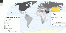
Global Carbon Dioxide Emissions
This maps shows current worldwide carbon dioxide(CO₂) emissions and per capita emissions from the consumption of energy. Data includes emissions due to the con ...4.69 rating | 39,505 views | 1 Comment15 years ago -
Environment
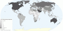
Current Worldwide Carbon Dioxide Emissions per Person
This map shows current worldwide carbon dioxide(CO₂) emissions per person from the consumption of energy. Data includes emissions due to the consumption of pet ...4.79 rating | 38,505 views | Discuss this15 years ago -
Environment
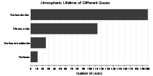
Atmospheric Lifetime of Different Greenhouse Gases
This chart shows atmospheric lifetime of different greenhouse gases. What is atmospheric lifetime? The lifetime of a greenhouse gas refers to the approximate a ...4.25 rating | 54,824 views | 3 Comments15 years ago -
Food & Agriculture
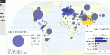
Global Nutrition Consumption and BMI
This map shows worldwide nutrition consumption and body mass index data. The dietary energy consumption per person is the amount of food, in kcal per day, for ea ...3.95 rating | 105,172 views | 7 Comments15 years ago -
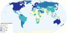
Information and Communication Technology
Global Internet Diffusion
Shows the level of Internet penetration by country globally3.00 rating | 5,474 views | Discuss this12 years ago -
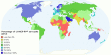
Country Info
Percentage of US GDP PPP Per-Capita (2012)
This visualization accounts for the percentage of Gross Domestic Product (Purchasing Power Parity) each country has in relation to the US. Data are collected fro ...5.00 rating | 3,352 views | Discuss this11 years ago -
Country Info
Happiest Countries in the World 2016
The happiest countries in the world have been ranked in the latest World Happiness Report with Denmark retaking top spot.4.14 rating | 19,767 views | Discuss this10 years ago -
Country Info
Happiest Countries in the World 2017
The happiest countries in the world have been ranked in the latest World Happiness Report. Norway has snatched the title of “the happiest country in the wo ...2.85 rating | 17,832 views | Discuss this9 years ago -
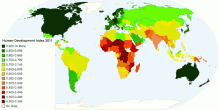
Country Info
Human Development Index 2011
This map shows the human development in 2001 with 187 countries5.00 rating | 4,989 views | Discuss this11 years ago -
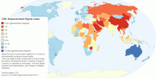
Country Info
CIRI: Empowerment Rights Index
Rates the level of government respect for a variety of internationally recognized human rights. This is an additive index constructed from the Foreign Movement, ...3.18 rating | 5,531 views | Discuss this10 years ago -
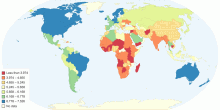
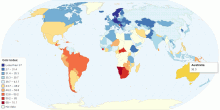
Economic
Distribution of Family Income - Gini Index
This map shows the degree of inequality in the distribution of family income (Gini index or Gini coefficient) in each country. Income distribution measure ...4.47 rating | 80,361 views | 6 Comments15 years ago -
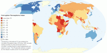
Country Info
Corruption Perceptions Index
Transparency International (TI) has published the Corruption Perceptions Index (CPI) since 1995, annually ranking countries "by their perceiv ...5.00 rating | 3,647 views | Discuss this10 years ago -
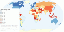
Country Info
Good Country Index
The Index attempts to measure the global impacts of national policies and behaviours: what the country contributes to the global commons and what they take away. ...2.86 rating | 10,656 views | Discuss this10 years ago -
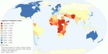
Country Info
Legatum Prosperity Index
The ranking is based on a variety of factors including wealth, economic growth, education, health, personal well-being, and quality of life. Source: Legatum (2015)0.00 rating | 4,131 views | Discuss this10 years ago -
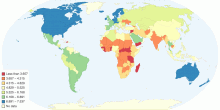
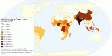
Country Info
Multidimensional Poverty Index: Number in MPI
Map represents number of population in MPI. Source: Oxford Poverty & Human Development Initiative (OPHI) and United Nations Development Programme (2015)3.35 rating | 5,791 views | Discuss this10 years ago