-
Country Info
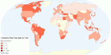
Company Wide Cbp Apps by (2011)
Internal Use only0.00 rating | 898 views | Discuss this11 years ago -
Country Info
ICRG
International Country Risk Guide0.00 rating | 1,182 views | Discuss this10 years ago -
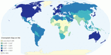
Country Info
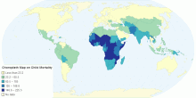
Choropleth Map on Child Mortality per thousand
This is a choropleth map describing the child mortality rate. The darker areas are where there are more deaths and these countries appear on the map near the equ ...5.00 rating | 938 views | Discuss this10 years ago -
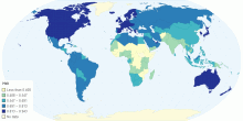
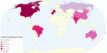
Country Info
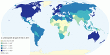
A Choropleth Graph of HDI in 2011
A Cohropleth graph showing HDI in 2011. The highest examples are in North America and Western Europe, eg. Norway 0.94. The lowest examples are in Sub-Sahar ...0.00 rating | 816 views | Discuss this10 years ago -
Country Info
Choropleth Map on HDI
Choropleth map on HDI 20110.00 rating | 842 views | Discuss this10 years ago -
Country Info
HDI in Countries of the World
HDI0.00 rating | 827 views | Discuss this10 years ago -
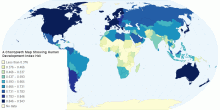
Country Info
A Choropleth Map Showing Human Development Index(HDI)
A 9-tone Choropleth map4.20 rating | 4,035 views | Discuss this10 years ago -
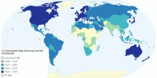
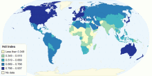
Society
A Chloropleth Map Showing the Hdi Worldwide
The map shows that generally the more northern and "western" countries have a higher HDI1.00 rating | 1,805 views | Discuss this10 years ago -
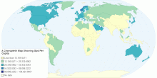
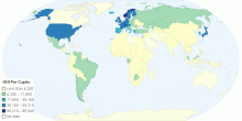
Economic
A Choropleth Map Showing Gpd Per Capita
The map again shows that generally the more northern and "western" countries have a higher GDP per Capita.0.00 rating | 2,210 views | Discuss this10 years ago -
Country Info
HDI
The HDI of the countries of the world.0.00 rating | 788 views | Discuss this10 years ago -
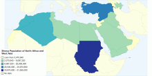
Food & Agriculture
Sheep Population of North Africa and West Asia
Animal heads of Northern Africa and Western Asia in 20093.67 rating | 3,375 views | Discuss this14 years ago -
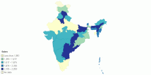
Country Info
Sales
sales Data0.00 rating | 1,519 views | Discuss this14 years ago -
Country Info
Human Development Index
Interesting~~~!!!5.00 rating | 2,141 views | Discuss this14 years ago -
Country Info
HDI Index
THIS IS THE MAP SHOWING ABOUT THE HUMAN DEVELOPMENT INDICATORS AROUND THE WORLD5.00 rating | 4,031 views | Discuss this14 years ago -
Country Info
GNI Per Capita
The data about GNI per capita around in 20105.00 rating | 4,499 views | Discuss this14 years ago