-
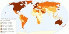
Economic
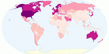
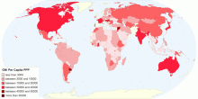
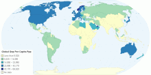
Global GNI per Capita,PPP for the Year 2006
Global GNI per Capita,PPP for the Year 20065.00 rating | 1,104 views | Discuss this13 years ago -
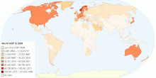
Economic
Gross Domestic Product Per Capita Current Us for 2009
This property belongs to Ryan Joe from Henan Experimental High School, China3.00 rating | 1,184 views | Discuss this13 years ago -
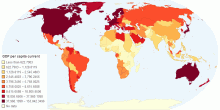
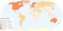
Economic
GDP Per Capita in Current USD for the Year 2009
World GDP 20095.00 rating | 2,747 views | Discuss this13 years ago -
Economic
Global GNI Per Capita ,PPP (current International U ...
francis 12A0.00 rating | 1,975 views | Discuss this13 years ago -
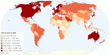
Economic
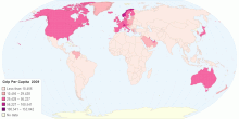
World GDP Per Capita (Current US$) for the Year 2009
The majority of this map's data comes from world bank data, an internationally authorized and credible data source. Some of data comes from other sources due ...5.00 rating | 2,700 views | Discuss this13 years ago -
Economic
Gdp Per Capita in current USD for the Year 2009
The map outlines the GDP per capita in current US$ for most countries and areas in the world in 2009. Different color indicates different value categories.0.00 rating | 2,598 views | Discuss this13 years ago -
Economic
GDP Per Capita in Current USD for the Year 2009
The map outlines the GDP per capita in current US$ for most countries and areas in the world in 2009. Different color indicates different value categories.5.00 rating | 2,592 views | Discuss this13 years ago -
Economic
The GNP per capita of World(2004)(current US dollars)
GNI per capita (formerly GNP per capita) is the gross national income, converted to U.S. and this is the world GNP per capita in 2004.(GNI)0.00 rating | 1,199 views | Discuss this13 years ago -
Economic
GNI per capita, PPP
http://data.worldbank.org/indicator/NY.GNP.PCAP.PP.CD?page=1 Cyprus: http://www.tradingeconomics.com/cyprus/gni-per-capita-ppp-us-dollar-wb-data.html Japan:&nb ...5.00 rating | 4,994 views | Discuss this13 years ago -
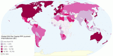
Economic
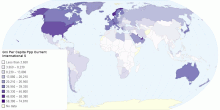
Gni Per Capita Ppp Current International
made by Shirley0.00 rating | 3,156 views | Discuss this13 years ago -
Economic
Gdp Per Capita Current Us
http://www.indexmundi.com/burma/gdp_per_capita_(ppp).html0.00 rating | 1,320 views | Discuss this13 years ago -
Economic
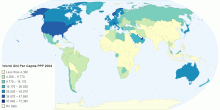
World GNI Per Capita PPP 2004
.......By Peter5.00 rating | 3,496 views | Discuss this13 years ago -
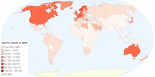
Economic
GNI Per Capita in 2009
This is the World GNI Per Capita in 20090.00 rating | 3,422 views | Discuss this13 years ago -
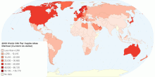
Economic
World GNI Per Capita, Atlas Method (Current Us dollar)
World GNI Per Capita Atlas Method Current Us0.00 rating | 4,567 views | Discuss this13 years ago -
Economic
Global Gnp Per Capita Ppp
global0.00 rating | 1,205 views | Discuss this13 years ago