-
Environment
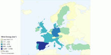
Wind Energy in tonne of oil equivalent in Europe in 2010
Source: Eurostat0.00 rating | 6,439 views | Discuss this14 years ago -
Environment
Test Map
this is a test map3.67 rating | 2,502 views | Discuss this14 years ago -
Environment
Tipos De Usos De Suelo En Mxico 2002
usos de suelo, Mexico,2002, INEGI, SEMARNAT3.00 rating | 2,614 views | Discuss this14 years ago -
Environment
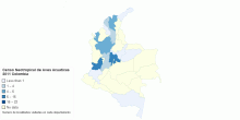
Censo Neotropical De Aves Acuaticas 2011 Colombia
Localidades visitadas durante el Censo Neotropical de Aves acuáticas realizado en Colombia en febrero y julio de 20110.00 rating | 1,820 views | Discuss this14 years ago -
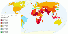
Environment
Percentage of People Who Know Something About Globa ...
This map depicts the countries where polls have examined the opinions about anthropogenic global warming. Those countries depicted in red reflect most informed o ...4.33 rating | 7,523 views | Discuss this14 years ago -
Environment
Percent of People Who Know Something About Global W ...
In this map, countries coloured in red reflect less than 50% of people who answered that they both knew something about global warming and did not think the warm ...1.00 rating | 5,293 views | Discuss this14 years ago -
Environment
Percent Who Know Something About Global Warming and ...
This map describes the distribution of people who both know something about global warming and think the temperature rise is caused by people. The lowest percent ...4.27 rating | 8,464 views | Discuss this14 years ago -
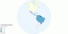
Environment
Porcentaje de bosques
Mapa de porcentaje de superficie de bosques5.00 rating | 2,494 views | Discuss this14 years ago -
Environment
Sara Martuscelli- Emisiones De Co2 Per Capita
Total population data from Gapminder. Original data was only the amount of Carbon (C) and calculation has been done to convert Carbon into Carbon Dioxide (CO2 ...1.00 rating | 3,163 views | Discuss this14 years ago -
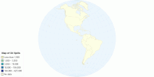
Environment
Map of Oil Spills
Oil Spills.2.82 rating | 6,391 views | Discuss this14 years ago -
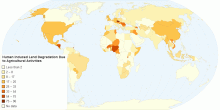
Environment
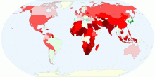
Human Induced Land Degradation Due to Agricultural ...
FAO database on land degradation. From TERRASTAT, Land resource potential and constraints statistics at country and regional level.4.50 rating | 5,428 views | Discuss this14 years ago -
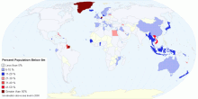
Environment
Percent Population Below 5m
This map depicts the percentage of people in the country that currently live below 5 m elevation above sea level. The implications of this map are that low-lying ...0.00 rating | 2,271 views | Discuss this14 years ago -
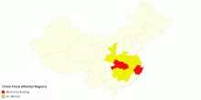
Environment
China Flood Affected Regions
this map shows flood affected areas5.00 rating | 3,078 views | Discuss this15 years ago -
Environment
Plastic Waste Per Coutry
Plastic Waste is growing higher and higher per country each year. It greatly effects the environment. Help save the environment and reuse plastic.0.00 rating | 1,534 views | Discuss this15 years ago -
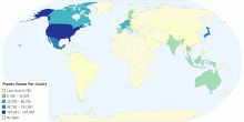
Environment
Plastic Waste Per Coutry
The amount of plastic waste per country is rising every year. It is greatly affecting the environment. Help save the environment and reuse plastic. Ameri ...5.00 rating | 2,217 views | Discuss this15 years ago