-
Health
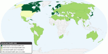
Universal Health Care around the World
This map shows Universal health care around the world. Universal health care is a national health insurance program in many countries that is mostly financed by ...4.36 rating | 75,119 views | 5 Comments16 years ago -
Health
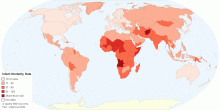
Current World Infant Mortality Rate
This map shows current world infant mortality rate. Infant mortality rate means the number of deaths of infants under one year old in a given year per 1,000 live ...4.37 rating | 36,052 views | Discuss this15 years ago -
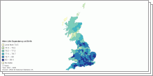
Health
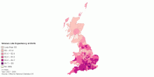
Women - Life Expectancy at Birth by UK Local Authority
This map shows Women life expectancy at birth by United Kingdom Local authority, 2007-2009.5.00 rating | 6,246 views | Discuss this15 years ago -
Health
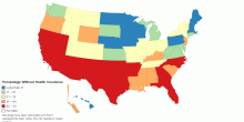
Percentage Without Health Insurance
This map shows % Without Health Insurance (2008-2009) rank.4.58 rating | 11,650 views | 2 Comments15 years ago -
Health
Current Worldwide Maternal Mortality Rate
This chart shows current worldwide Maternal Mortality Rate per 100,000 live births. Current World Maternal mortality rates (2008): 251 per 100,000 live births ...4.33 rating | 43,393 views | Discuss this16 years ago -
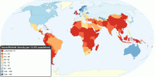
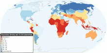
Health
Global Distribution of Nurse/Midwife per 10,000 population
This map shows the density of nursing and midwifery personnel as the number of nurses/midwives per 10,000 population, in 2000 - 2009. World Nurses/Midwives ...4.33 rating | 31,862 views | Discuss this16 years ago -
Health
Incidence of Tuberculosis per 100,000 population
This map shows the estimated number of Tuberculosis(TB) cases arising in a given time period (expressed here as rate per 100 000 population/year). All forms of T ...4.41 rating | 16,323 views | Discuss this15 years ago -
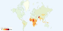
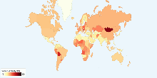
Health
Current World HIV/AIDS Adult Prevalence Rate
This chart shows current world HIV/AIDS adult prevalence rate. Current World HIV/AIDS Adult Prevalence Rate: 0.8% (an estimate of the percentage of adults (aged ...4.31 rating | 16,315 views | 3 Comments17 years ago -
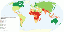
Health
Percentage of Births Attended by Skilled Health Personnel
This map shows percentage of deliveries attended by health personnel(doctors, nurses or midwives) trained in providing life saving obstetric care, including givi ...4.31 rating | 18,816 views | 4 Comments15 years ago -
Health
Current World HIV/AIDS Deaths
This chart shows current world HIV/AIDS deaths. Current World HIV/AIDS Deaths: 2 million4.33 rating | 13,720 views | 2 Comments17 years ago -
Health
Current Worldwide Cancer Mortality Rate
This chart shows current worldwide Cancer Age-standardized Mortality Rate. Cancer is a leading cause of death worldwide: it accounted for 7.4 million deaths (aro ...4.21 rating | 30,712 views | 4 Comments17 years ago -
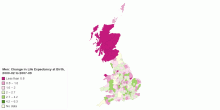
Health
Men: Change in Life Expectancy at Birth by UK Local ...
This map shows Men change in life expectancy at birth by United Kingdom Local authority, 2000-02 to 2007-09.5.00 rating | 5,147 views | Discuss this15 years ago -
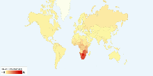
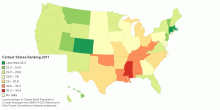
Health
United States of Obesity: Fattest States Ranking - 2011
This map shows United States of obesity: 2011 Fattest States Ranking. The rankings use a three-year average in order to smooth out statistical fluctuations. For ...4.19 rating | 186,588 views | 15 Comments15 years ago -
Health
Global Distribution of Physicians per 10,000 population
This map shows the density of physicians personnel as the number of physicians per 10,000 population, in 2000 - 2009. World Physicians Density: 14 per 10, ...4.15 rating | 88,786 views | 2 Comments16 years ago -
Health
Current United Kindgom Life Expectancy at Birth
These page shows Men/Women life expectancy at birth and change in life expectancy at birth by United Kingdom Local authority for 2007-2009.3.67 rating | 4,845 views | Discuss this15 years ago