-
Health
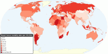
Current Worldwide Breast Cancer Mortality Rate
This map shows current worldwide Breast Cancer Age-standardised mortality rates. Breast cancer is by far the most frequent cancer among women with an estimated 1 ...4.57 rating | 39,815 views | 1 Comment16 years ago -
Health
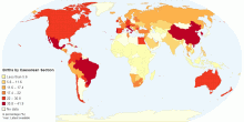
Percentage of Births by Caesarean Section
This map shows percentage of births by caesarean section among all live births in a given time period.4.63 rating | 38,136 views | Discuss this15 years ago -
Health
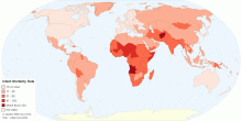
Current World Infant Mortality Rate
This map shows current world infant mortality rate. Infant mortality rate means the number of deaths of infants under one year old in a given year per 1,000 live ...4.37 rating | 35,772 views | Discuss this15 years ago -
Health
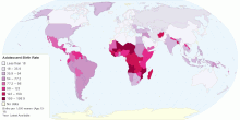
Adolescent Birth Rate
This map shows adolescent birth rate, that measures the annual number of births to women 15 to 19 years of age per 1,000 women in that age group. It represents t ...4.55 rating | 34,992 views | 3 Comments14 years ago -
Health
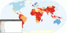
Global Distribution of Nurse/Midwife per 10,000 population
This map shows the density of nursing and midwifery personnel as the number of nurses/midwives per 10,000 population, in 2000 - 2009. World Nurses/Midwives ...4.33 rating | 31,449 views | Discuss this15 years ago -
Health
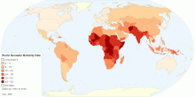
Current Worldwide Neonatal Mortality Rate (per 1000 ...
This map shows World Neonatal mortality rate. Neonatal mortality rate defined as number of deaths during the first 28 completed days of life per 1000 live births ...4.58 rating | 30,842 views | Discuss this15 years ago -
Health
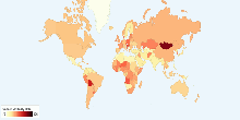
Current Worldwide Cancer Mortality Rate
This chart shows current worldwide Cancer Age-standardized Mortality Rate. Cancer is a leading cause of death worldwide: it accounted for 7.4 million deaths (aro ...4.21 rating | 30,506 views | 4 Comments16 years ago -
Health
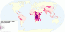
Proportion of Population Below Minimum Level of Die ...
This map shows proportion population below minimum level of dietary energy consumption. World: 13% of total population (848 million) Undernourishment refers to ...4.76 rating | 24,506 views | Discuss this15 years ago -
Health
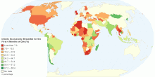
Percentage of Infants Exclusively Breastfed for the ...
This map shows percentage of Infants that are exclusively breastfed for the first six months of life. The World Health Organization (WHO) and the American Acade ...4.72 rating | 22,860 views | 2 Comments15 years ago -
Health
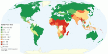
Household Solid Fuel Use
This Map shows the percentage of the total population that burn solid fuels in their households, primarily for cooking fuel. Solid fuels include coal or biomass ...4.63 rating | 22,836 views | 4 Comments15 years ago -
Health
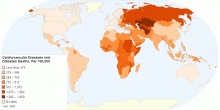
Mortality due to Cardiovascular Diseases and Diabetes
The above map shows the age-standardized estimate of mortality by Cardiovascular diseases and diabetes per 100,000 people. Heart disease or cardiovascular disea ...4.68 rating | 21,767 views | 2 Comments15 years ago -
Health
Current World Total Fertility Rate
This chart shows current world total fertility rate. Current World Total Fertility Rate: 2.58 children born/woman over her lifetime3.46 rating | 19,732 views | Discuss this17 years ago -
Health
Population Below Minimum Level of Dietary Energy Co ...
This map shows population below minimum level of dietary energy consumption. World: 848 million (13% of total population) Undernourishment refers to the condit ...3.67 rating | 19,407 views | Discuss this15 years ago -
Health
Current World Death Rate
This chart shows current world death rate. Current World Death Rate: 8.23 deaths/1,000 people4.05 rating | 18,933 views | 1 Comment17 years ago -
Health
Current World People Living with HIV/AIDS
This chart shows current world people living with HIV/AIDS. Current World People Living with HIV/AIDS: 33 million3.42 rating | 18,895 views | 3 Comments17 years ago
