-
Social
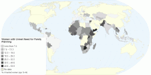
Women with Unmet Need for Family Planning
This map shows the percentage of fertile women of reproductive age (15 to 49 years) who are not using contraception and report that they do not want children or ...4.00 rating | 15,944 views | Discuss this15 years ago -
Social
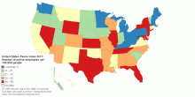
United States Peace Index 2011: Police Officers Ranking
This map shows Number of police employees per 100,000 people rank in United States Peace Index (USPI) 2011. Number of police employees per 100,000 people rank i ...3.86 rating | 10,155 views | 1 Comment15 years ago -
Social
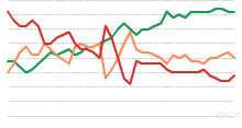
Worldwide Distribution of Suicides Rates by Gender ...
This chart shows worldwide distribution of suicides rates by gender and age for year 2000. Suicide is among the three leading causes of death among those aged 15 ...4.08 rating | 48,782 views | 3 Comments17 years ago -
Social
Freedom on the Net - 2011
This map shows 2011 global Freedom on the Net for 37 countries. What is Freedom on the Net? Freedom on the Net aims to measure each country's level of inte ...4.02 rating | 23,951 views | 5 Comments15 years ago -
Social
Percentage of People Having Sex Weekly by Country
This chart shows worldwide percentage of people having sex weekly. Average frequency of having sex among 26 countries: 67%4.08 rating | 707,166 views | 14 Comments17 years ago -
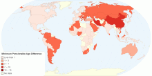
Social
Difference Between Pensionable Age: Men and Women
This map shows the difference between men and women in minimum pensionable age. The minimum pensionable age is the age at which a person can retire and receive ...3.00 rating | 12,666 views | Discuss this15 years ago -
Social
The Best and Worst Countries to Be a Mother
This map shows 2010 Mothers' Index around the world. The Mothers' Index helps document conditions for mothers and children in 160 countries (43 developed nations ...4.00 rating | 50,116 views | 8 Comments16 years ago -
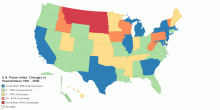
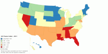
Social
U.S. Peace Index: Changes in Peacefulness 1991 - 2009
This map shows U.S. Peace Index: Changes in Peacefulness 1991 - 2009. First-ever ranking of peace in the U.S. shows the nation has become more peaceful since 19 ...3.50 rating | 16,202 views | Discuss this15 years ago -
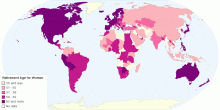
Social
What is the Statutory Retirement Age for Women in t ...
This map shows the statutory retirement age for women in the private sector. The statutory retirement age is the age at which women working in the private sector ...3.50 rating | 17,301 views | Discuss this15 years ago -
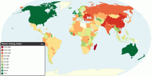
Social
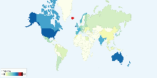
World Giving Index
This map shows World Giving Index in 153 countries around the world. The World Giving Index allows us to establish a rounded view of charitable behaviour worldwi ...3.99 rating | 56,097 views | 7 Comments16 years ago -
Social
United States Peace Index 2011 - Score
This map shows 2011 United States Peace Index (USPI) Score. The United States Peace Index (USPI) is the first in a series of national peace indices that will bu ...3.67 rating | 15,894 views | 1 Comment15 years ago -
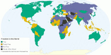
Social
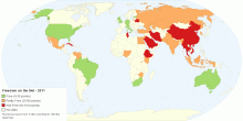
Freedom in the World
This map shows Freedom in the World in 2015. Free: 89 countries Partly Free: 54 countries Not Free: 42 countries Worst of the Worst: 9 countries ...3.93 rating | 177,586 views | Discuss this11 years ago -
Social
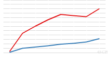
Historical Freedom in the World, 1972 to Present
This chart shows historical Freedom in the World - 1972 onwards. What is Freedom in the World? and How is the Freedom of the World calculated? Note: 1982: T ...3.67 rating | 16,065 views | Discuss this17 years ago -
Social
Number of Cinema Admissions per Person by Country, ...
This chart shows number of cinema admissions per person in each country. Number of cinema admissions in the major countries: ~1.45 visits per person3.85 rating | 29,842 views | 4 Comments17 years ago -
Social
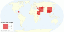
Number of Journalists in Prison Worldwide
This map shows number of journalists in prison worldwide. As of December 1, 2010 there are 145 journalists in prison worldwide. Iran and China, with 34 impriso ...3.67 rating | 20,777 views | 11 Comments15 years ago