-
Social
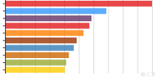
Top 10 Most Pirated Movies of 2010
This graph shows top 10 most pirated movies of 2010. With 16,580,000 downloads on BitTorrent alone, Avatar is undisputedly the most pirated film of the year 201 ...4.26 rating | 25,844 views | 1 Comment16 years ago -
Social
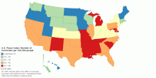
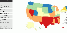
United States Peace Index 2011: Homicides Ranking
This map shows Number of homicides per 100,000 people rank in United States Peace Index (USPI) 2011. Number of homicides per 100,000 people rank is one of the f ...3.56 rating | 25,194 views | 1 Comment15 years ago -
Social
Number of Cinema Admissions by Country, latest avai ...
This chart shows number of cinema admissions in each country. Number of cinema admissions in the major countries: ~6,870,868,430 Note: More cin ...3.62 rating | 23,958 views | Discuss this17 years ago -
Social
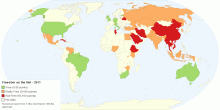
Freedom on the Net - 2011
This map shows 2011 global Freedom on the Net for 37 countries. What is Freedom on the Net? Freedom on the Net aims to measure each country's level of inte ...4.02 rating | 23,951 views | 5 Comments15 years ago -
Social
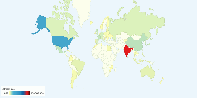
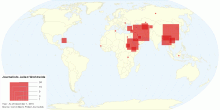
Number of Journalists in Prison Worldwide
This map shows number of journalists in prison worldwide. As of December 1, 2010 there are 145 journalists in prison worldwide. Iran and China, with 34 impriso ...3.67 rating | 20,777 views | 11 Comments15 years ago -
Social
World Internet Freedom
This chart shows internet freedom around the world. The Internet represents freedom, but not everywhere. Under the pretext of protecting morals, national securi ...3.73 rating | 20,298 views | 3 Comments17 years ago -
Social
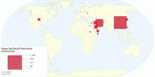
Reported Death Sentence Executions
This map shows death sentence executions in 2011.5.00 rating | 19,723 views | Discuss this14 years ago -
Social
Percentage of Wages Paid During Maternity Leave aro ...
This chart shows percentage of wages paid during maternity leave around the World. Note: see note - Check Dataset for more information.4.72 rating | 19,383 views | 1 Comment17 years ago -
Social
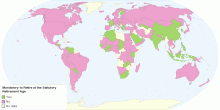
In the Private Sector, is It Mandatory to Retire at ...
This map shows is it mandatory or not to retire at the statutory retirement age. If there is an age after which a person is no longer allowed to work, and that ...4.33 rating | 18,834 views | Discuss this15 years ago -
Social
United States Peace Index 2011
This map shows 2011 United States Peace Index. Key findings: First-ever ranking of peace in the U.S. shows the nation has become more peaceful since 1995 Repo ...4.26 rating | 18,689 views | 3 Comments15 years ago -
Social
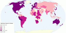
What is the Statutory Retirement Age for Women in t ...
This map shows the statutory retirement age for women in the private sector. The statutory retirement age is the age at which women working in the private sector ...3.50 rating | 17,301 views | Discuss this15 years ago -
Social
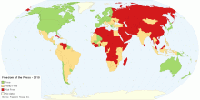
Freedom of the Press Global Status
This map shows Freedom of the Press around the world. Free: 69 (35%) countries Partly Free: 64 (33%) countries Not Free: 63 (32%) countries What is Freed ...4.33 rating | 16,822 views | Discuss this15 years ago -
Social
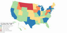
U.S. Peace Index: Changes in Peacefulness 1991 - 2009
This map shows U.S. Peace Index: Changes in Peacefulness 1991 - 2009. First-ever ranking of peace in the U.S. shows the nation has become more peaceful since 19 ...3.50 rating | 16,202 views | Discuss this15 years ago -
Social
Historical Freedom in the World, 1972 to Present
This chart shows historical Freedom in the World - 1972 onwards. What is Freedom in the World? and How is the Freedom of the World calculated? Note: 1982: T ...3.67 rating | 16,065 views | Discuss this17 years ago -
Social
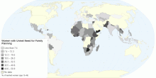
Women with Unmet Need for Family Planning
This map shows the percentage of fertile women of reproductive age (15 to 49 years) who are not using contraception and report that they do not want children or ...4.00 rating | 15,944 views | Discuss this15 years ago