-
Social
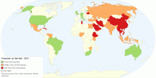
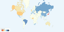
Freedom on the Net - 2011
This map shows 2011 global Freedom on the Net for 37 countries. What is Freedom on the Net? Freedom on the Net aims to measure each country's level of inte ...4.02 rating | 23,848 views | 5 Comments15 years ago -
Energy
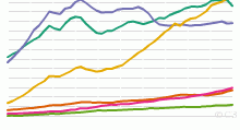
Historical Oil Consumption by Region, 1965 to Present
This chart shows the historical Oil Consumption in barrels per day - 1965 onwards. List of countries included in each region: North America includes United ...4.07 rating | 46,994 views | 2 Comments17 years ago -
Environment
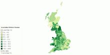
How Many British Homes Have Been Insulated by the G ...
This interactive map shows percentage of British homes have been insulated by the Government's Carbon Emissions Reduction Target (CERT). Over 2.6m homes acr ...3.40 rating | 7,529 views | 1 Comment15 years ago -
Population
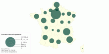
Current France Population
This interactive map shows current France population (2010 est.) Total France: 62,799,180 people (2010 est.) (incl France métropolitaine)3.40 rating | 5,345 views | Discuss this15 years ago -
Religion
Neo-religions Adherents by Country
This chart shows current Neo-religions followers by Country. Neo-religion includes Neo-Confucianism and Neo-Paganism. Number of Neo-religions followers in the wo ...3.90 rating | 22,404 views | Discuss this17 years ago -
Education
School Life Expectancy, Primary to Tertiary around ...
This chart shows school life expectancy (years), primary to tertiary education around the world. School life expectancy (SLE) is the total number of years of sch ...4.00 rating | 19,495 views | Discuss this17 years ago -
Health
Men - Life Expectancy at Birth by UK Local Authority
This map shows Men life expectancy at birth by United Kingdom Local authority, 2007-2009.3.67 rating | 7,451 views | Discuss this15 years ago -
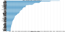
Social
Percentage of People Having Sex Weekly by Country
This chart shows worldwide percentage of people having sex weekly. Average frequency of having sex among 26 countries: 67%4.08 rating | 704,589 views | 14 Comments17 years ago -
Work
Over-the-Year (2009 - 2010) Change in Unemployment ...
This map shows over-the-Year (2009 - 2010) change in unemployment rates for United States. Unemployment Rates for United States: 9.6% unemployed (2010 annual av ...3.77 rating | 20,944 views | Discuss this15 years ago -
Education
Starting Age of Compulsory Education around the World
This chart shows official school starting age of compulsory education around the world. Average official school starting age of compulsory education: 5.9 years ...4.06 rating | 59,958 views | 8 Comments17 years ago -
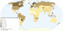
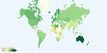
Energy
Alternative and Nuclear Energy (Percentage of Total ...
This map shows clean energy, expressed as a percentage of total energy use. Clean energy is noncarbohydrate energy that does not produce carbon dioxide whe ...4.02 rating | 46,047 views | 7 Comments15 years ago -
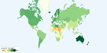
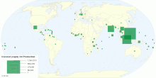
Food & Agriculture
Worldwide Coconut (copra) Oil Production
This map shows worldwide coconut (copra) oil production in tonnes. Current world Coconut oil production: 3,734,208 tonnes What is Copra? Copra is dried sectio ...3.82 rating | 11,487 views | Discuss this15 years ago -
Education
School Life Expectancy, Primary to Tertiary around ...
This chart shows school life expectancy (years), primary to tertiary education for male around the world. School life expectancy (SLE) is the total number of yea ...3.00 rating | 9,814 views | Discuss this17 years ago -
People
Top 100 Baby Boy Names of 2010
This chart shows top 100 baby boy names in England and Wales through 2010. Oliver retained the top spot this year, with Jack still the second most popular baby ...3.00 rating | 14,354 views | Discuss this15 years ago -
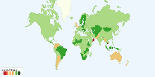
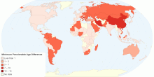
Social
Difference Between Pensionable Age: Men and Women
This map shows the difference between men and women in minimum pensionable age. The minimum pensionable age is the age at which a person can retire and receive ...3.00 rating | 12,602 views | Discuss this15 years ago