-
Health
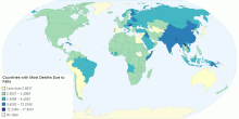
Countries with Most Deaths Due to Falls
Which countriest are the clumsiest?0.00 rating | 2,490 views | Discuss this11 years ago -
Country Info
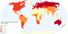
Wine Consumption Per Capita (Per Year in Litres)
This map was created by BusinessVibes and represents the amount of wine consumed per capita, per year in Litres. All data taken from the World Health Organization5.00 rating | 3,087 views | Discuss this12 years ago -
Health
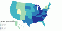
Spare Pounds Per State
This map highlights obesity in the US by state by showing the average number of spare pounds per person. It uses data from here: http://www.insureme. ...5.00 rating | 5,117 views | Discuss this12 years ago -
Health
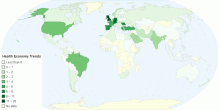
Health Economy Trends
EFORT0.00 rating | 2,366 views | Discuss this13 years ago -
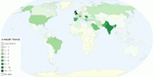
Health
e-Health Trends
EFORT1.00 rating | 1,518 views | Discuss this13 years ago -
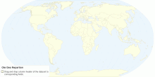
Health
Ote Geo Repartion
OTE newsletter reprtion (trend Jan-May 2013)0.00 rating | 4,640 views | Discuss this13 years ago -
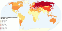
People
Countries by Cigarette Consumption Per Capita 2007
Tobacco cigarette consumption in 2007.3.00 rating | 4,422 views | Discuss this13 years ago -
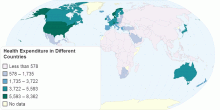
Country Info
Health Expenditure in Different Countries
This is a map about health expenditure ( per capita in current US$) among different countries in the world.5.00 rating | 2,477 views | Discuss this13 years ago -
Health
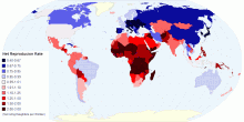
Net Reproductive Rate
An estimate of the number of daughters each woman would give birth to who would survive into their childbearing years, if each woman and daughter was subjected t ...5.00 rating | 6,993 views | Discuss this14 years ago -
Population
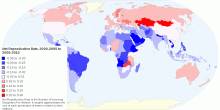
Change in Net Reproductive Rate between 2000-2005 a ...
This maps the change in Net Reproductive Rate between the 5 year period at the beginning of the previous decade and the 5 year period that ended this decade. NRR ...5.00 rating | 4,496 views | Discuss this14 years ago -
Health
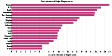
France, the World’s Most Depressed Nation?
The study, which was conducted by researchers from the State University of New York at Stony Brook as part of the WHO's World Mental Health Survey Initiative ...4.52 rating | 9,758 views | Discuss this15 years ago -
Health
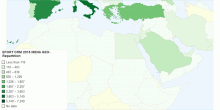
EFORT CRM MENA GEO-Repartition
Statistics 20160.00 rating | 2,537 views | Discuss this9 years ago -
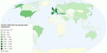
Health
EFORT CRM 2016 Worldwide GEO-Repartition
EFORT CRM 2016 Statistics0.00 rating | 2,549 views | Discuss this9 years ago -
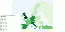
Country Info
EFORT CRM 2016 Europe GEO-Repartition
EFORT CRM 2016 EUROPE GEO REPARTITION0.00 rating | 899 views | Discuss this9 years ago -
Health
Most Common Cancer in Your Country
This chart shows Most Common Cancer in your Country. Cancer is a group of diseases involving abnormal cell growth with the potential to invade or spread to oth ...4.35 rating | 14,305 views | Discuss this10 years ago