-
Population
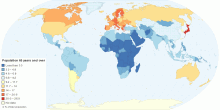
Current Countries with the Oldest Population in the World
This map shows current countries with the oldest population in the world. Oldest population means the distribution of the population in age group 65 years and ov ...4.18 rating | 84,546 views | 1 Comment15 years ago -
Energy
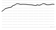
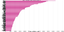
Historical World Reserves-to-production ratio of Oi ...
This chart shows the Historical World Reserves-to-production ratio of Oil - 1980 onwards. Current World Reserves-to-production ratio of Oil: 42.11 Years What D ...4.17 rating | 23,998 views | Discuss this17 years ago -
Economic
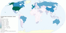
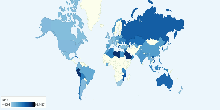
Foreign Direct Investment (FDI), inward stock
This interactive map shows the value of inward stock of foreign direct investment at the country-level, in million US dollars. Global foreign direct investment ...4.17 rating | 15,807 views | Discuss this15 years ago -
Environment
Threatened Species of Plants in each Country
This chart shows threatened species of plants in each Red List category in each country. Number of threatened species of plants in 2008: 10962 Current Number o ...4.14 rating | 11,812 views | 1 Comment17 years ago -
People
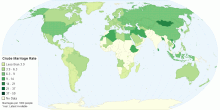
Crude Marriage Rate
This map shows crude marriage rate, that is the annual number of marriages per 1,000 population.4.16 rating | 20,613 views | Discuss this15 years ago -
Social
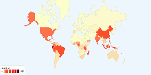
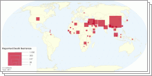
Death Sentences and Executions 2011
This maps shows death sentence and executions in 2011.4.17 rating | 423,240 views | 5 Comments14 years ago -
Education
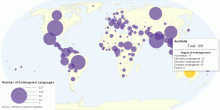
Number of Endangered Languages by Country
This map shows the number of endangered languages in each country. Total number of endangered languages in the world: 3074 Vulnerable: 725 Definitely endang ...4.17 rating | 79,139 views | 3 Comments15 years ago -
Social
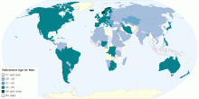
What is the Statutory Retirement Age for Men in the ...
This map shows the statutory retirement age for men in the private sector. The statutory retirement age is the age at which men working in the private sector can ...4.16 rating | 188,532 views | Discuss this15 years ago -
People
Top 100 Baby Girl Names of 2010
This chart shows top 100 baby girl names in England and Wales through 2010. Olivia retained the top spot for the second year running. Among the top 10, Sophie r ...4.14 rating | 11,091 views | Discuss this15 years ago -
Energy
Historical Natural Gas Production by Region, 1970 t ...
This chart shows the historical Natural Gas Production - 1970 onwards. List of countries included in each region: North America includes United States,Canad ...4.11 rating | 13,097 views | Discuss this17 years ago -
Energy
Current Worldwide Natural Gas Consumption per capita
This chart shows current Natural Gas Consumption in the world. Current Natural Gas Consumption in the World: 444.1 cubic meters (m³) per capita4.15 rating | 13,766 views | Discuss this17 years ago -
Energy
Current Worldwide Reserves-to-production ratio of N ...
This chart shows the Current Worldwide Reserves-to-production ratio of Natural Gas. Current World Reserves-to-production ratio of Natural Gas: 60.35 Years What ...4.15 rating | 15,629 views | 1 Comment17 years ago -
Population
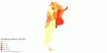
República Argentina por provincia. Densidad de pob ...
This map shows population density from 2010 census of República Argentina.4.15 rating | 19,819 views | Discuss this15 years ago -
Information and Communication Technology
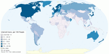
Number of Internet Users by Country, per 100 People
This world map shows Number of Internet Users by Country, per 100 people. Internet users are people with access to the worldwide network. Current worldwide numb ...4.14 rating | 68,137 views | 2 Comments15 years ago -
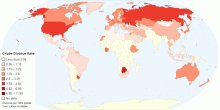
People
Crude Divorce Rate
This map shows crude divorce rate, that is the annual number of divorces per 1,000 population.4.13 rating | 29,020 views | Discuss this15 years ago