-
Social
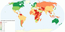
Corruption Around the World
This chart shows Corruption Perceptions Index (CPI) around the world. The CPI index score on a scale from 100 (very clean) to 0 (highly corrupt) What is the Cor ...4.03 rating | 14,864 views | Discuss this11 years ago -
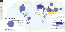
Social
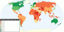
Corruption around the World
This chart shows Corruption Perceptions Index (CPI) around the world. The CPI index score on a scale from 10 (very clean) to 0 (highly corrupt). 2010 CPI key fi ...4.52 rating | 90,928 views | 8 Comments16 years ago -
Social
The Best and Worst Countries to Be a Mother
This map shows 2010 Mothers' Index around the world. The Mothers' Index helps document conditions for mothers and children in 160 countries (43 developed nations ...4.00 rating | 49,902 views | 8 Comments16 years ago -
Social
World Child Development Index
This chart shows the Child Development Index (CDI) around the world. World Performance CDI Score: 17.5 Time period: 2000-2006 Education: 11.4 H ...4.13 rating | 29,333 views | Discuss this16 years ago -
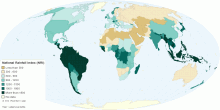
Environment
National Rainfall Index (NRI)
This map shows national rainfall index (NRI). Waht is National Rainfall Index (NRI)? A national rainfall index (NRI) is defined as the national average of the ...4.62 rating | 38,326 views | Discuss this15 years ago -
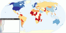
Economic
Global Competitiveness Index
This map shows 2010-2011 Global Competitiveness Index (GCI) in 139 major and emerging economies from all of the world's regions. The GCI, a highly comprehensive ...4.49 rating | 38,953 views | 3 Comments16 years ago -
Environment
Global Carbon Dioxide Emissions
This maps shows current worldwide carbon dioxide(CO₂) emissions and per capita emissions from the consumption of energy. Data includes emissions due to the con ...4.69 rating | 39,504 views | 1 Comment15 years ago -
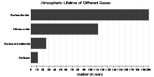
Environment
Atmospheric Lifetime of Different Greenhouse Gases
This chart shows atmospheric lifetime of different greenhouse gases. What is atmospheric lifetime? The lifetime of a greenhouse gas refers to the approximate a ...4.25 rating | 54,822 views | 3 Comments15 years ago -
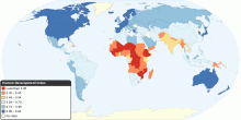
Food & Agriculture
Global Nutrition Consumption and BMI
This map shows worldwide nutrition consumption and body mass index data. The dietary energy consumption per person is the amount of food, in kcal per day, for ea ...3.95 rating | 105,157 views | 7 Comments15 years ago -
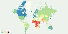
Economic
Distribution of Family Income - Gini Index
This map shows the degree of inequality in the distribution of family income (Gini index or Gini coefficient) in each country. Income distribution measure ...4.47 rating | 80,360 views | 6 Comments15 years ago -
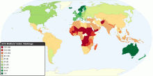
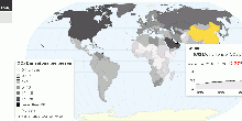
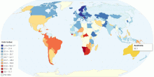
Economic
Human Development Index (HDI)
This map shows Human Development Index (HDI) for 169 countries in the World. Update for 2010 What is Human Development Index? The Human Development Index (HDI ...4.19 rating | 60,951 views | 3 Comments16 years ago -
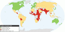
Social
The Legatum Prosperity Index
This map shows the Prosperity Index for 110 countries. 2010 Key Findings: Entrepreneurship and opportunity correlate more closely to a nation's overall pros ...4.33 rating | 32,470 views | 3 Comments15 years ago -
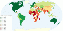
People
World Happiness Index
This chart shows the World Happiness Report 2015. The World Happiness Report is a measure of happiness published by the United Nations Sustainable Development S ...4.32 rating | 22,747 views | Discuss this10 years ago