-
Population
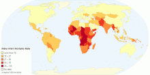
Male Infant Mortality Rate by Country
This chart shows Male Infant Mortality Rate by Country. The infant mortality rate (IMR) is the number of deaths of infants under one year old per 1,000 live bi ...3.80 rating | 7,736 views | Discuss this9 years ago -
Health
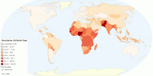
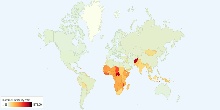
Current Worldwide Stillbirth Rate (per 1000 births)
This map shows Worldwide Stillbirth rate (per 1000 births). Stillbirth is the term used to describe the loss of a pregnancy or the birth of an infant that has di ...4.70 rating | 78,588 views | Discuss this14 years ago -
Health
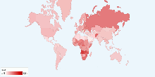
Cancer Deaths per 100,000 Population by Country
This chart shows the Cancer Deaths per 100,000 population by country. Cancer is a relatively common disease. Generally, this category should include only people ...3.29 rating | 13,408 views | Discuss this9 years ago -
Health
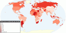
Current Worldwide Cancer Mortality Rate
This chart shows current worldwide Cancer Age-standardized Mortality Rate. Cancer is a leading cause of death worldwide: it accounted for 7.4 million deaths (aro ...4.21 rating | 29,553 views | 4 Comments16 years ago -
Health
Current Worldwide Breast Cancer Mortality Rate
This map shows current worldwide Breast Cancer Age-standardised mortality rates. Breast cancer is by far the most frequent cancer among women with an estimated 1 ...4.57 rating | 38,551 views | 1 Comment15 years ago -
Health
Current Worldwide Maternal Mortality Rate
This chart shows current worldwide Maternal Mortality Rate per 100,000 live births. Current World Maternal mortality rates (2008): 251 per 100,000 live births ...4.33 rating | 42,331 views | Discuss this15 years ago -
Health
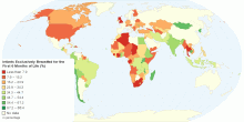
Percentage of Infants Exclusively Breastfed for the ...
This map shows percentage of Infants that are exclusively breastfed for the first six months of life. The World Health Organization (WHO) and the American Acade ...4.71 rating | 22,108 views | 2 Comments14 years ago -
Health
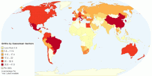
Percentage of Births by Caesarean Section
This map shows percentage of births by caesarean section among all live births in a given time period.4.63 rating | 36,877 views | Discuss this14 years ago -
People
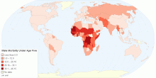
Male Mortality Under Age Five
This chart shows male mortality (under age 5) details by country. Mortality rate, or death rate,is a measure of the number of deaths (in general, or due to a sp ...0.00 rating | 3,004 views | Discuss this10 years ago -
Health
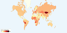
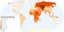
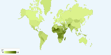
Mortality due to Cardiovascular Diseases and Diabetes
The above map shows the age-standardized estimate of mortality by Cardiovascular diseases and diabetes per 100,000 people. Heart disease or cardiovascular disea ...4.68 rating | 20,922 views | 2 Comments14 years ago -
Economic
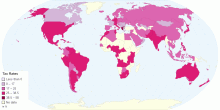
Tax Rates by Country
This chart shows Tax Rates by Country. This is a list of tax rates around the world. It focuses on Two types of tax: & ...4.33 rating | 9,275 views | Discuss this8 years ago -
Immigration
Migration Rate by Country
This chart shows migration rate by country (migrant(s)/1,000 population).4.24 rating | 16,245 views | Discuss this16 years ago -
Health
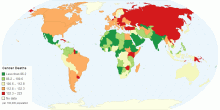
Current World Death Rate
This chart shows current world death rate. Current World Death Rate: 8.23 deaths/1,000 people4.05 rating | 18,082 views | 1 Comment16 years ago -
Health
Current World Birth Rate
This chart shows current world birth rate. Current World Birth Rate: 19.95 births/1,000 people This entry gives the average annual number of births during a ye ...3.59 rating | 45,663 views | 5 Comments16 years ago -
Economic
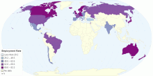
Employment Rate by Country
This chart shows Employment Rate by Country Employment is a relationship between two parties, usually based on a contract where work is paid for, where on ...4.17 rating | 35,964 views | Discuss this8 years ago