-
Health
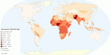
Current Worldwide Stillbirth Rate (per 1000 births)
This map shows Worldwide Stillbirth rate (per 1000 births). Stillbirth is the term used to describe the loss of a pregnancy or the birth of an infant that has di ...4.70 rating | 80,488 views | Discuss this15 years ago -
Health
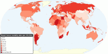
Current Worldwide Breast Cancer Mortality Rate
This map shows current worldwide Breast Cancer Age-standardised mortality rates. Breast cancer is by far the most frequent cancer among women with an estimated 1 ...4.57 rating | 39,899 views | 1 Comment16 years ago -
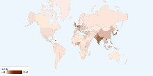
Health
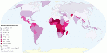
Adolescent Birth Rate
This map shows adolescent birth rate, that measures the annual number of births to women 15 to 19 years of age per 1,000 women in that age group. It represents t ...4.55 rating | 35,053 views | 3 Comments15 years ago -
Health
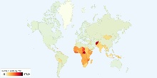
Current Worldwide Maternal Mortality Rate
This chart shows current worldwide Maternal Mortality Rate per 100,000 live births. Current World Maternal mortality rates (2008): 251 per 100,000 live births ...4.33 rating | 43,238 views | Discuss this16 years ago -
Population
Current World Population
This chart shows current world population. Current World Population: 6,790,062,2164.19 rating | 47,139 views | Discuss this17 years ago -
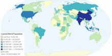
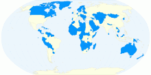
Population
Current World Population
This map shows an estimate from the US Bureau of the Census based on statistics from population censuses, vital statistics registration systems, or sample survey ...4.25 rating | 27,985 views | Discuss this10 years ago -
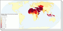
Religion
Religion of the World by Number of Adherents
This group of maps shows major religions of the world ranked by percentage of Adherents. Islam Adherents by country Hinduism Adherents by country Christiani ...3.88 rating | 17,537 views | Discuss this11 years ago -
Population
Historical Population of Andorra, 1947 to Present
This chart shows the historical population statistics of Andorra - 1947 onwards.4.33 rating | 18,526 views | 1 Comment17 years ago -
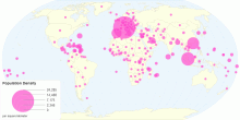
Population
Current World Population Density
This chart shows current world population density. Current World Population Density: 13.31 people per km²4.13 rating | 33,927 views | 2 Comments17 years ago -
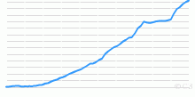
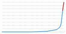
Population
Historical Population of World, 1 AD to Future
This chart shows the historical population statistics of World - 1 AD onwards.3.83 rating | 68,725 views | 5 Comments17 years ago -
Immigration
Refugee Population by Country of Asylum
This chart shows the Refugee Population by Asylum. A refugee is a person who is outside their country of citizenship because they have well-founded grounds for ...3.00 rating | 9,296 views | Discuss this10 years ago -
Population
Population Density(2015)
This chart shows the Population Density (per square kilometer) by country in 2015. Population density is a measurement of population per unit area or unit volum ...3.22 rating | 15,812 views | Discuss this10 years ago -
Population
Countries with Lower Population Than Tokyo
This chart shows the Countries with smaller population than Tokyo. Tokyo is huge. It is not really one city, it's more like twenty that all just happen to b ...4.64 rating | 18,572 views | Discuss this10 years ago -
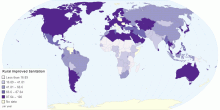
Others
Rural Improved Sanitation Facilities of Population ...
This chart shows rural improved sanitation facilities of population details by country. The improved sanitation facilities include flush/pour flush (to ...3.00 rating | 4,298 views | Discuss this11 years ago -
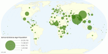
Education
School Entrance Age Population by Country
This chart shows school entrance age population by country. Entrance age of primary is the age at which students would enter primary education, assuming they ha ...3.67 rating | 5,078 views | Discuss this11 years ago