-
Health
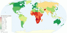
Current World Life Expectancy at Birth
This map shows current world life expectancy at birth. Life expectancy at birth is the expected average number of years to be lived by a group of people born in ...4.49 rating | 132,375 views | 2 Comments15 years ago -
Education
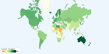
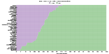
School Life Expectancy, Primary to Tertiary around ...
This chart shows school life expectancy (years), primary to tertiary education around the world. School life expectancy (SLE) is the total number of years of sch ...4.00 rating | 19,455 views | Discuss this17 years ago -
Education
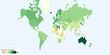
School Life Expectancy, Primary to Tertiary around ...
This chart shows school life expectancy (years), primary to tertiary education for male around the world. School life expectancy (SLE) is the total number of yea ...3.00 rating | 9,745 views | Discuss this17 years ago -
Education
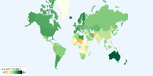
School Life Expectancy, Primary to Tertiary around ...
This chart shows school life expectancy (years), primary to tertiary education for female around the world. School life expectancy (SLE) is the total number of y ...4.56 rating | 9,659 views | Discuss this17 years ago -
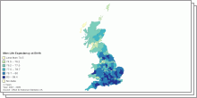
Health
Men - Life Expectancy at Birth by UK Local Authority
This map shows Men life expectancy at birth by United Kingdom Local authority, 2007-2009.3.67 rating | 7,412 views | Discuss this15 years ago -
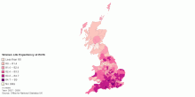
Health
Women - Life Expectancy at Birth by UK Local Authority
This map shows Women life expectancy at birth by United Kingdom Local authority, 2007-2009.5.00 rating | 6,116 views | Discuss this15 years ago -
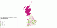
Health
Men: Change in Life Expectancy at Birth by UK Local ...
This map shows Men change in life expectancy at birth by United Kingdom Local authority, 2000-02 to 2007-09.5.00 rating | 5,090 views | Discuss this15 years ago -
Health
Current United Kindgom Life Expectancy at Birth
These page shows Men/Women life expectancy at birth and change in life expectancy at birth by United Kingdom Local authority for 2007-2009.3.67 rating | 4,781 views | Discuss this15 years ago -
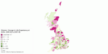
Health
Women: Change in Life Expectancy at Birth by UK Loc ...
This map shows Women change in life expectancy at birth by United Kingdom Local authority, 2000-02 to 2007-09.0.00 rating | 4,624 views | Discuss this15 years ago -
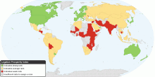
Social
The Legatum Prosperity Index
This map shows the Prosperity Index for 110 countries. 2010 Key Findings: Entrepreneurship and opportunity correlate more closely to a nation's overall pros ...4.33 rating | 32,427 views | 3 Comments15 years ago -
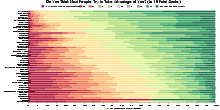
Society
Do You Think Most People Try to Take Advantage of You?
This chart shows the result of (one question in) survey conducted by the World Values Survey (WVS) about Perceptions of Life: Do you think most people would try ...4.28 rating | 110,204 views | 15 Comments15 years ago -
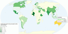
Environment
Would You Give Part of Your Income for the Environment
This map shows the result of one question about environment: Would you give part of your income for the environment from the World Values Survey (WVS). What is ...4.11 rating | 410,055 views | 3 Comments16 years ago -
Environment
Happy Planet Index (HPI)
This map shows the overall scores from the second global compilation of the Happy Planet Index (HPI). The HPI is an index of human well-being and environmental i ...3.99 rating | 63,318 views | 9 Comments16 years ago -
Social
Do You Live with Your Parents?
This chart shows the result of (one question) survey conducted by the World Values Survey (WVS) about housing: Do you live with your parents? What is World ...4.22 rating | 34,816 views | 1 Comment15 years ago -
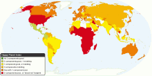
Economic
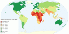
Human Development Index (HDI)
This map shows Human Development Index (HDI) for 169 countries in the World. Update for 2011 What is Human Development Index? The Human Development Index (HDI ...4.00 rating | 202,026 views | 16 Comments14 years ago