-
Country Info
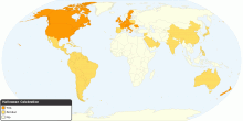
Halloween Celebration Around the World
This chart shows halloween celebration around the world. **** Happy Halloween! **** What is Halloween? Holiday observed on October 31, the eve of All Saints' ...3.60 rating | 53,358 views | 16 Comments16 years ago -
Health
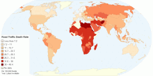
Estimated Road Traffic Fatal Injury Death Rate (Per ...
This chart shows the estimated number of road traffic deaths, per 100,000 population per year. WHO estimates about 1.2 million people die each year on the world ...4.55 rating | 53,186 views | 5 Comments15 years ago -
Drugs & Crime
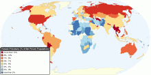
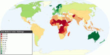
World Female Prisoners (percentage within the Priso ...
This map shows the percentage of female prisoners within each national prison population. Female prisoners includes women and girls held in penal institutions, a ...4.60 rating | 52,215 views | Discuss this16 years ago -
Population
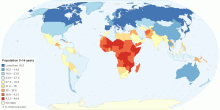
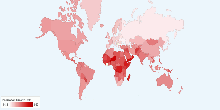
Current Countries with the Youngest Population in the World
This map shows current countries with the youngest population in the world. Youngest population means the distribution of the population in age group 0-14 years. ...3.87 rating | 52,155 views | 2 Comments15 years ago -
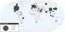
Energy
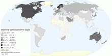
Electricity Consumption Per Capita
Electricity consumption per capita measures the average kilowatt-hours (kWh) of electrical power generated per person in a particular country or region. Note: E ...4.20 rating | 51,695 views | Discuss this15 years ago -
Country Info
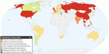
International Privacy Index
This map shows the Privacy Index in the world. Since 1997 the UK-based Privacy International in cooperation with the US-based Electronic Privacy Information Cen ...4.26 rating | 51,309 views | Discuss this16 years ago -
People
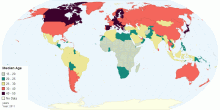
Global Median Age
This map shows the median age that divides a population into two numerically equal groups; that is, half the people are younger than this age and half are older. ...4.58 rating | 51,114 views | 2 Comments15 years ago -
Country Info
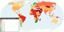
Proportion of Seats Held by Women in National Parliaments
This map shows percentage of parliamentary seats in national parliaments held by women. World Avarage: Total number of seats in national parliaments: 38, ...4.54 rating | 50,630 views | 2 Comments16 years ago -
Social
The Best and Worst Countries to Be a Mother
This map shows 2010 Mothers' Index around the world. The Mothers' Index helps document conditions for mothers and children in 160 countries (43 developed nations ...4.00 rating | 49,914 views | 8 Comments16 years ago -
Drugs & Crime
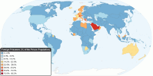
World Foreign Prisoners percentage within the Priso ...
This map shows the percentage of foreign prisoners within each national prison population. Foreign prisoners includes men and women held in penal institutions, ...4.29 rating | 49,286 views | 1 Comment16 years ago -
Environment
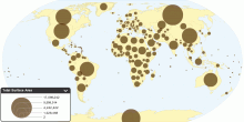
Total Surface Area by Country
This map shows Total surface area by country. Total surface area of world: 510,072,000 sq km Total area is the sum of all land and water areas delimited by inter ...3.81 rating | 49,255 views | 3 Comments16 years ago -
Population
Current World Population Growth Rate
This chart shows current world population growth rate. Current World Population Growth Rate: 1.17%3.42 rating | 48,933 views | 7 Comments17 years ago -
Social
Worldwide Distribution of Suicides Rates by Gender ...
This chart shows worldwide distribution of suicides rates by gender and age for year 2000. Suicide is among the three leading causes of death among those aged 15 ...4.08 rating | 48,681 views | 3 Comments16 years ago -
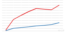
Energy
Current Worldwide Oil Consumption
This chart shows current oil consumption in the world. Current Oil Consumption in the World: 84,455,330 barrels per day (bbl/day) 1 barrel = (42 US gallons, 158. ...3.96 rating | 47,692 views | 42 Comments16 years ago -
Population
Current World Population
This chart shows current world population. Current World Population: 6,790,062,2164.19 rating | 47,201 views | Discuss this17 years ago