-
Health
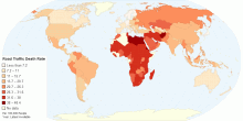
Estimated Road Traffic Fatal Injury Death Rate (Per ...
This chart shows the estimated number of road traffic deaths, per 100,000 population per year. WHO estimates about 1.2 million people die each year on the world ...4.55 rating | 53,207 views | 5 Comments15 years ago -
Energy
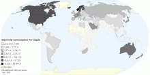
Electricity Consumption Per Capita
Electricity consumption per capita measures the average kilowatt-hours (kWh) of electrical power generated per person in a particular country or region. Note: E ...4.20 rating | 51,704 views | Discuss this15 years ago -
Health
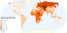
Mortality due to Cardiovascular Diseases and Diabetes
The above map shows the age-standardized estimate of mortality by Cardiovascular diseases and diabetes per 100,000 people. Heart disease or cardiovascular disea ...4.68 rating | 21,863 views | 2 Comments15 years ago -
Health
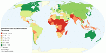
Percentage of Births Attended by Skilled Health Personnel
This map shows percentage of deliveries attended by health personnel(doctors, nurses or midwives) trained in providing life saving obstetric care, including givi ...4.31 rating | 18,726 views | 4 Comments15 years ago -
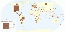
Infrastructure
Total Number of Airports by Country
This map shows the total number of airports or airfields recognizable from the air around the world. Total number of airports in the World: 43,982 (Year: 2010) ...3.87 rating | 161,150 views | 5 Comments15 years ago -
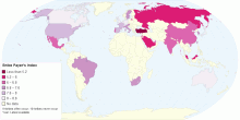
Social
Bribe Payer's Index by Transparency International
The Bribe Payer's Index (BPI) measures the tendency of firms from top exporting countries to pay bribes or make undocumented payments while conducting busine ...4.50 rating | 27,646 views | 1 Comment15 years ago -
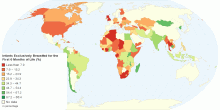
Health
Percentage of Infants Exclusively Breastfed for the ...
This map shows percentage of Infants that are exclusively breastfed for the first six months of life. The World Health Organization (WHO) and the American Acade ...4.72 rating | 22,959 views | 2 Comments15 years ago -
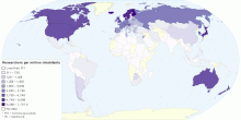
Education
Number of Researchers per million inhabitants by Country
This map shows the distribution of researchers per million inhabitants, latest available year. Researchers are professionals engaged in the conception or creatio ...4.62 rating | 251,932 views | 16 Comments15 years ago -
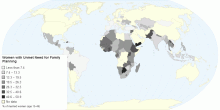
Social
Women with Unmet Need for Family Planning
This map shows the percentage of fertile women of reproductive age (15 to 49 years) who are not using contraception and report that they do not want children or ...4.00 rating | 15,874 views | Discuss this15 years ago -
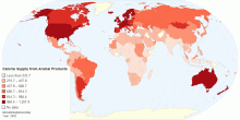
Food & Agriculture
Calorie Supply Per Capita from Animal Products
This map refers to the amount of available food from animal products, expressed in calories per person, per day. Animal products include: all types of meat and f ...4.25 rating | 39,770 views | 1 Comment15 years ago -
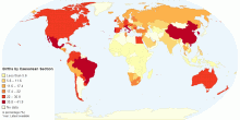
Health
Percentage of Births by Caesarean Section
This map shows percentage of births by caesarean section among all live births in a given time period.4.63 rating | 38,309 views | Discuss this15 years ago -
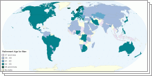
Social
Worldwide Retirement ages
This collection of interactive maps shows the statutory retirement age and minimum pensionable age at the country-level.4.38 rating | 190,589 views | 1 Comment15 years ago -
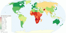
Health
Current World Life Expectancy at Birth
This map shows current world life expectancy at birth. Life expectancy at birth is the expected average number of years to be lived by a group of people born in ...4.49 rating | 132,535 views | 2 Comments15 years ago -
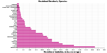
Others
Gestational Duration by Species
This chart shows gestational or incubation duration in days by gestational age. Gestational age is the age of an embryo or fetus (or newborn infant)4.63 rating | 26,017 views | Discuss this15 years ago -
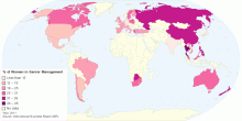
Work
Proportion of Women in Senior Management - 2011
This map shows proportion of Women in Senior Management (2011). Global average: 20% of Women in Senior Management Research from the 2011 Grant Thornton Inter ...4.76 rating | 20,438 views | 1 Comment15 years ago