-
Environment
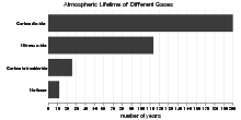
Atmospheric Lifetime of Different Greenhouse Gases
This chart shows atmospheric lifetime of different greenhouse gases. What is atmospheric lifetime? The lifetime of a greenhouse gas refers to the approximate a ...4.25 rating | 54,840 views | 3 Comments15 years ago -
People
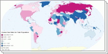
World Sex Ratio 2011
This collection of interactive maps shows Sex Ratio in five age groups - at birth, under 15 years, 15-64 years, 65 years and over, and for the total population. ...4.01 rating | 218,370 views | 3 Comments15 years ago -
Education
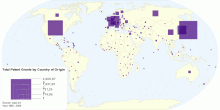
Total Patent Grants by Country of Origin: 1995 - 2009
This map show total Patent Grants by Country of Origin for the period 1995 - 2009. Patent indicators presented in this map is based on the concept of "coun ...4.50 rating | 26,445 views | 3 Comments15 years ago -
Economic
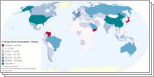
Foreign Investment 2011
This collection of interactive maps shows Foreign Direct Investment (FDI) at the country-level. Foreign direct investment (FDI) is a measure of foreign ownership ...4.49 rating | 64,029 views | 1 Comment15 years ago -
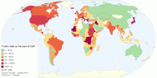
Economic
General Government Debt as Percent of GDP by Country
This interactive map shows historical data and forecast of general government gross debt (as percent of GDP) in each country. Government debt (also known as publ ...4.69 rating | 130,957 views | 11 Comments15 years ago -
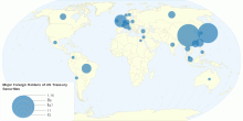
Economic
How Much Money Does America Owe Other Countries?
This interactive map shows leading foreign holders of United States Treasury Securities (at end of period - May 2011). Grand total: US $4,514 billions What is ...3.96 rating | 210,056 views | 34 Comments15 years ago -
People
Top 100 Baby Names in England and Wales through 2010
This group of interactive chart shows top 100 baby names in England and Wales through 2010. Oliver and Olivia remained the most popular baby names in England and Wales.4.61 rating | 18,520 views | 3 Comments15 years ago -
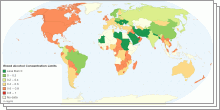
Country Info
Road Safety Laws
A collection of interactive maps shows the different Road Safety Laws. List of maps in this set: Legal Blood Alcohol Concentration (BAC) Limits around the Wo ...4.27 rating | 56,030 views | 10 Comments15 years ago -
Others
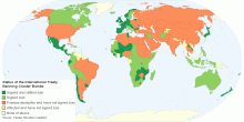
Worldwide Ban on Cluster Bombs
This interactive map shows status of an international treaty (Convention on Cluster Munitions) that prohibits the manufacture, use, transfer and stockpile of clu ...4.76 rating | 12,884 views | Discuss this15 years ago -
Food & Agriculture
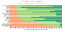
Characteristics of different Cooking Oils
These charts shows fat composition and smoke point of different Cooking Oils. Cooking oil is purified fat of plant/animal origin, which is usually liquid at room ...4.61 rating | 40,177 views | 4 Comments15 years ago -
Others
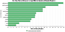
How Many Hours of Sleep on Average Different Specie ...
This chart shows the average sleeping hours that mammals require per day. Note: Image inside tooltip is from wikipedia.org4.31 rating | 57,472 views | 2 Comments15 years ago -
Health
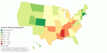
United States of Obesity: Fattest States Ranking - 2011
This map shows United States of obesity: 2011 Fattest States Ranking. The rankings use a three-year average in order to smooth out statistical fluctuations. For ...4.19 rating | 186,467 views | 15 Comments15 years ago -
Information and Communication Technology
Internet and Telecommunications Statistics
This visualization shows number of internet users, fixed telephone lines and mobile cellular telephone subscriptions by country4.65 rating | 61,070 views | 12 Comments15 years ago -
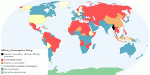
Country Info
Military Conscription Policy by Country
This map shows the status of Conscription Policy by country. Conscription (also known as "The Draft", the "Call-up" or "National service ...4.54 rating | 258,946 views | 28 Comments15 years ago -
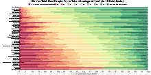
Society
Do You Think Most People Try to Take Advantage of You?
This chart shows the result of (one question in) survey conducted by the World Values Survey (WVS) about Perceptions of Life: Do you think most people would try ...4.28 rating | 110,239 views | 15 Comments15 years ago