-
Population
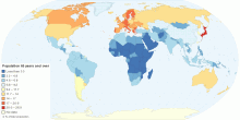
Current Countries with the Oldest Population in the World
This map shows current countries with the oldest population in the world. Oldest population means the distribution of the population in age group 65 years and ov ...4.18 rating | 82,786 views | 1 Comment14 years ago -
Population
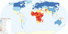
Current Countries with the Youngest Population in the World
This map shows current countries with the youngest population in the world. Youngest population means the distribution of the population in age group 0-14 years. ...3.87 rating | 50,447 views | 2 Comments14 years ago -
Population
Current Countries with the Adult Population in the World
This map shows current countries with the adult population in the world. Adult population means the distribution of the population in age group 15-64 years. Cur ...4.02 rating | 27,769 views | Discuss this14 years ago -
People
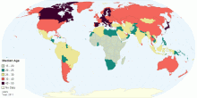
Global Median Age
This map shows the median age that divides a population into two numerically equal groups; that is, half the people are younger than this age and half are older. ...4.58 rating | 46,618 views | 2 Comments14 years ago -
Population
India's Population Density
This map shows India's population density in 2011 census. India's Population Density:382 persons per sq. km. (2011) India's Population Density: 325 ...4.01 rating | 64,369 views | 5 Comments14 years ago -
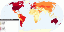
Food & Agriculture
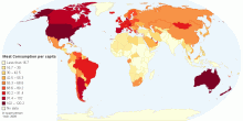
Current Worldwide Annual Meat Consumption per capita
This map shows current worldwide annual Meat Consumption per capita. World average meat consumption: 41.90 kg per person per year4.54 rating | 723,104 views | 46 Comments12 years ago -
Food & Agriculture
Current Worldwide Annual Meat Consumption per capita
This map shows current worldwide annual Meat Consumption per capita. World average meat consumption: 46.6 kg per person per year4.69 rating | 179,226 views | 25 Comments15 years ago -
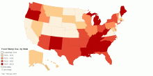
Food & Agriculture
Food Stamp Use, by State
This map shows the percent of the population on food stamps in United States America. More Americans are using food stamps, but the percent of the population en ...4.58 rating | 66,487 views | 8 Comments14 years ago -
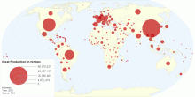
Food & Agriculture
Current Worldwide Annual Meat Production in tonnes ...
This map shows current worldwide annual Meat Production in tonnes per country. World average meat production: 727,052,012 tonnes per year.4.55 rating | 22,084 views | Discuss this12 years ago -
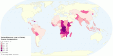
Health
Proportion of Population Below Minimum Level of Die ...
This map shows proportion population below minimum level of dietary energy consumption. World: 13% of total population (848 million) Undernourishment refers to ...4.76 rating | 23,322 views | Discuss this14 years ago -
Health
Population Below Minimum Level of Dietary Energy Co ...
This map shows population below minimum level of dietary energy consumption. World: 848 million (13% of total population) Undernourishment refers to the condit ...3.67 rating | 16,385 views | Discuss this14 years ago -
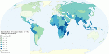
Food & Agriculture
Contribution of Carbohydrates in Total Dietary Consumption
This map shows contribution of carbohydrates in total dietary energy consumption. World: 63% Developed countries: 53% Developing World: 67% Sub-Saharan Afr ...4.23 rating | 358,752 views | Discuss this14 years ago -
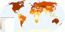
Food & Agriculture
Daily Protein Intake Per Capita
This map shows dietary protein consumption per person. The dietary protein consumption per person is the amount of protein in food, in grams per day, for each in ...4.62 rating | 141,695 views | 1 Comment14 years ago -
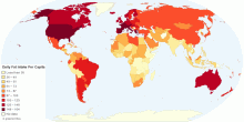
Food & Agriculture
Daily Fat Intake Per Capita
This map shows dietary fat consumption per person. The dietary fat consumption per person is the amount of fat in food, in grams per day, for each individual in ...4.53 rating | 79,963 views | 4 Comments14 years ago -
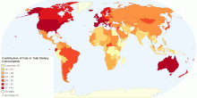
Food & Agriculture
Contribution of Fats in Total Dietary Consumption
This map shows contribution of fats in total dietary energy consumption. World: 26% Developed countries: 34% Developing World: 23% Sub-Saharan Africa: 18% ...4.57 rating | 38,830 views | Discuss this14 years ago